

What was the problem?
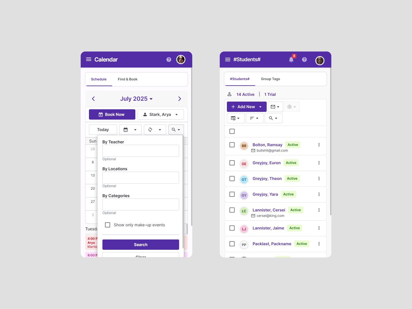
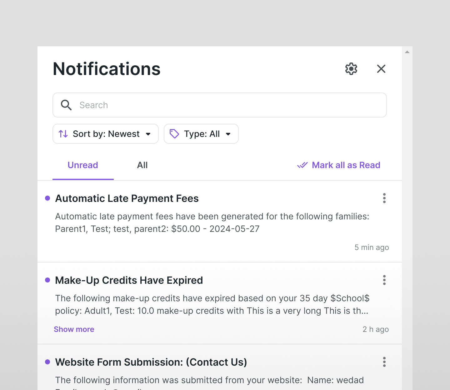
In the old interface, filtering was implemented via a “Search” button.
Clicking it opened a small dropdown that contained:
- a manual search field at the top,
- a scrollable list of filters below,
- and action buttons (Apply / Clear) at the bottom.
This solution was inconvenient — especially on pages with many filters or on mobile devices.
Users couldn’t clearly see what they had entered and often didn’t understand what exactly was being filtered. The only indicator was a badge showing the number of active filters.
Even applying a basic search required scrolling to the bottom of the list and clicking “Apply,” which slowed down interaction.
Meanwhile, the new filter panel we had implemented on the Attendance page showed excellent results: all filters were visible, actions were clear, and the logic was intuitive and predictable.
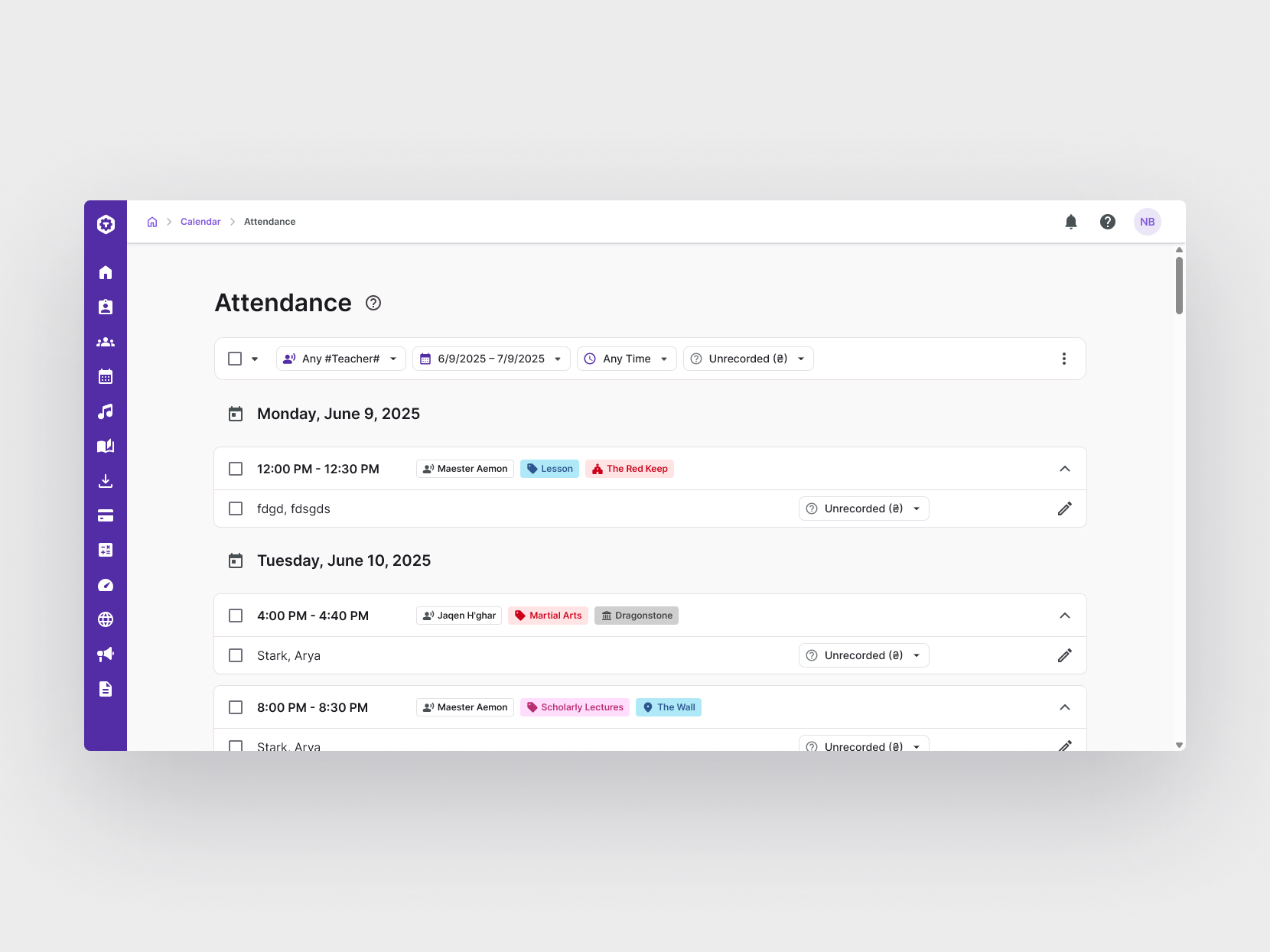
However, it was not possible to simply “reuse” this panel across the product — not technically, not visually. A unified architectural solution was needed that would fit the platform in terms of logic, responsiveness, and visual style.
Role & Constraints
I led and executed this project end to end. The goal wasn’t just to replace a UI component — it was to rethink the entire architecture of filtering, sorting, and content control across the platform.
This included:
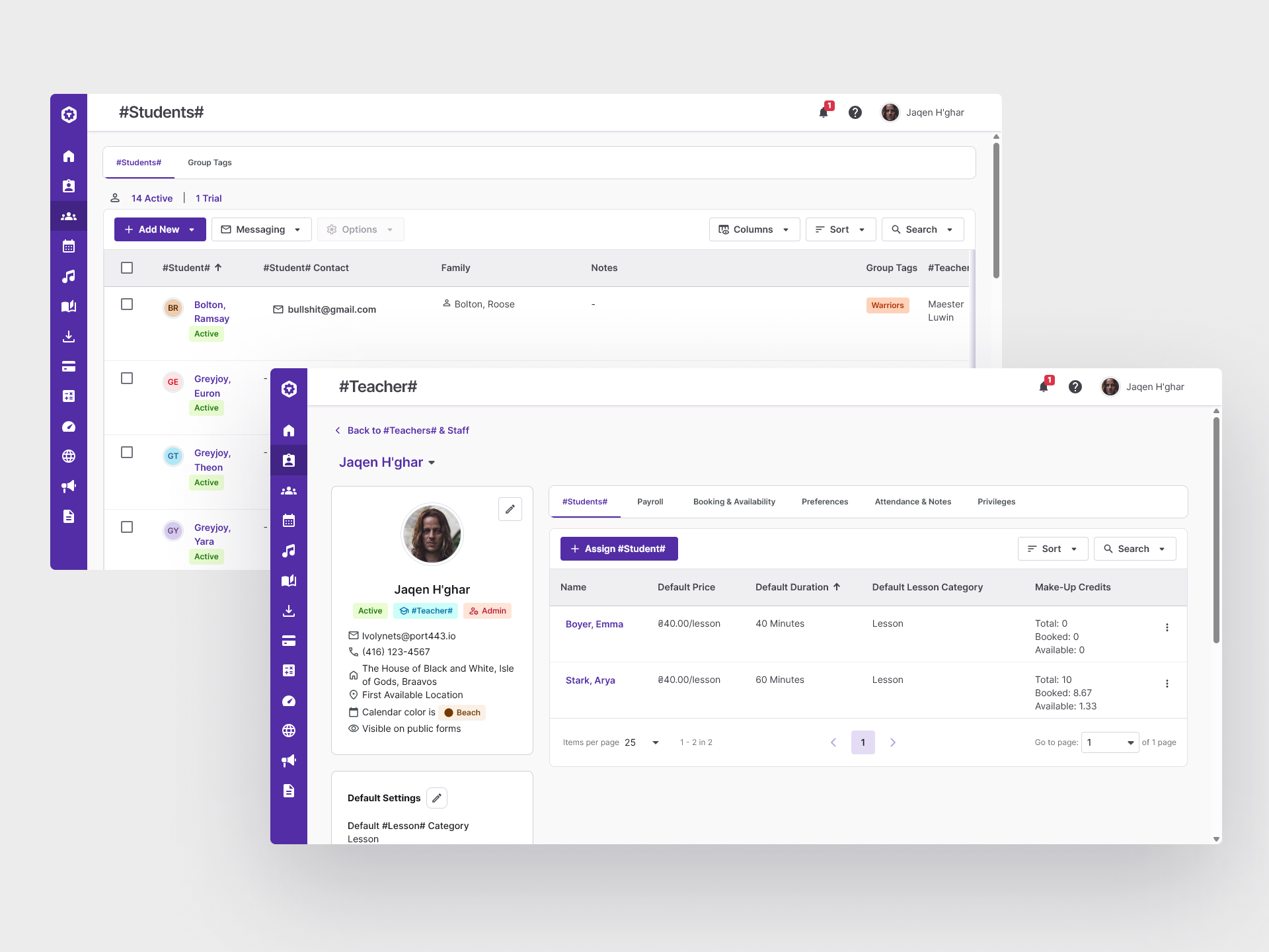
- auditing all current implementations of toolbars, filters, search, sorting, and display settings
- designing a universal, scalable solution that would work across ~80% of user-facing pages
- defining responsive behavior for the new filter bar on desktop, tablet, and mobile screens
Constraints:
- We couldn’t drastically change the UI across all pages — the solution had to integrate into the existing system with minimal refactoring
- The transition to the new solution had to be smooth to avoid frustrating users who were used to the old patterns
- Different modules had different toolbar logic — some included sorting, others view settings, others just actions. We needed a unified system to ensure consistent UX
- The old solution was cluttered on mobile — the new one had to be clean, compact, and responsive
Approach
One of the typical solutions with the filter panel is to display the selected filters – this immediately gives the user an idea of what was selected.
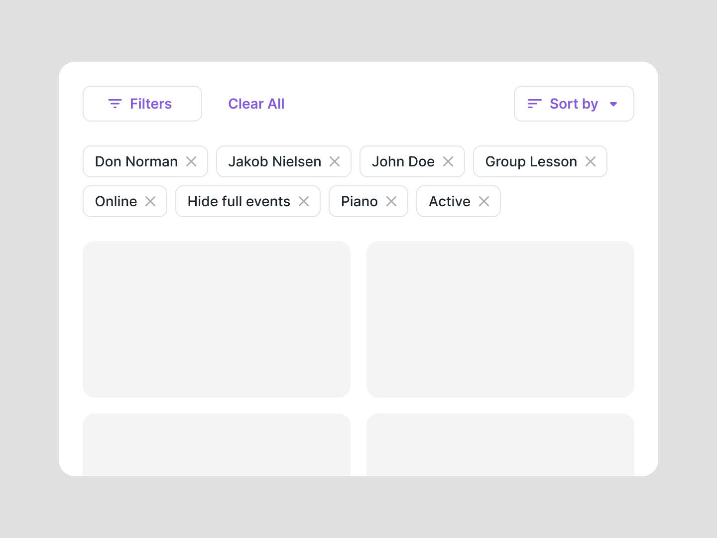
At first, I tried improving the existing toolbar — restructuring buttons, making filters more visible, and displaying applied filters below.
This helped on desktop but didn’t solve the core problems:
- Simple search was still hidden
- Not all pages had sorting or table view controls — so layout wasn’t consistent
- Some pages had no filters at all, just a search field — but it was still inside a dropdown
- Mobile usability was still poor
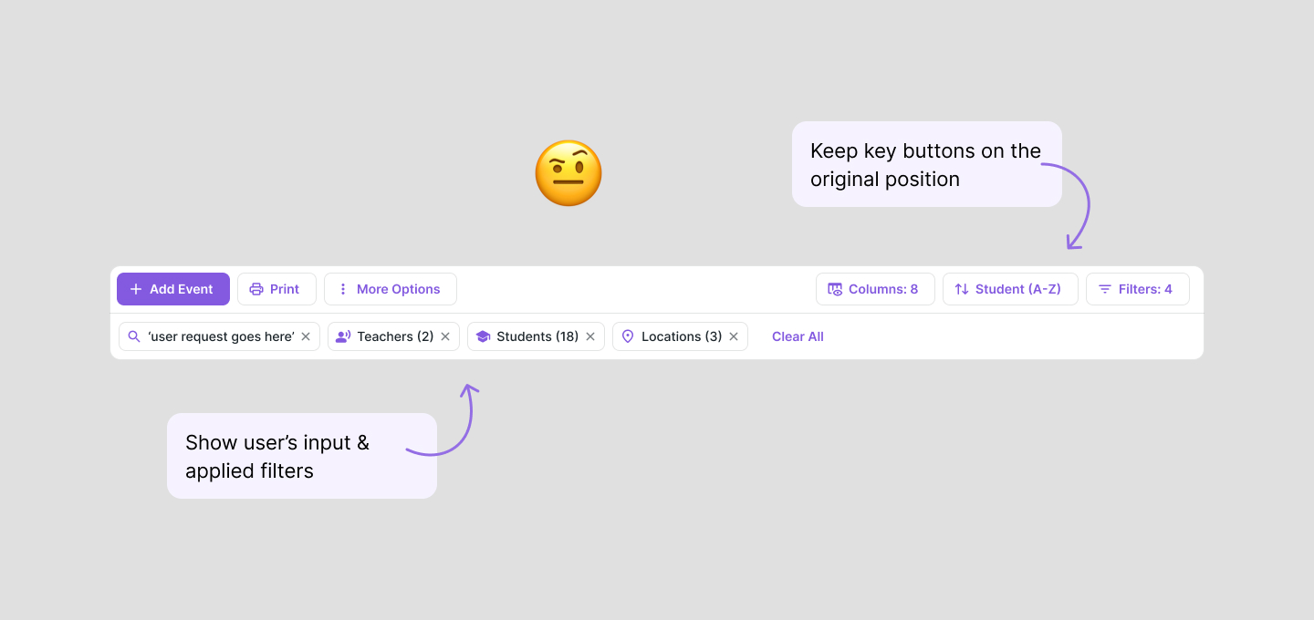
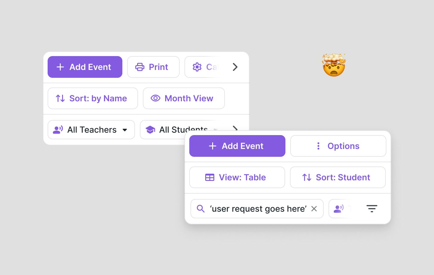
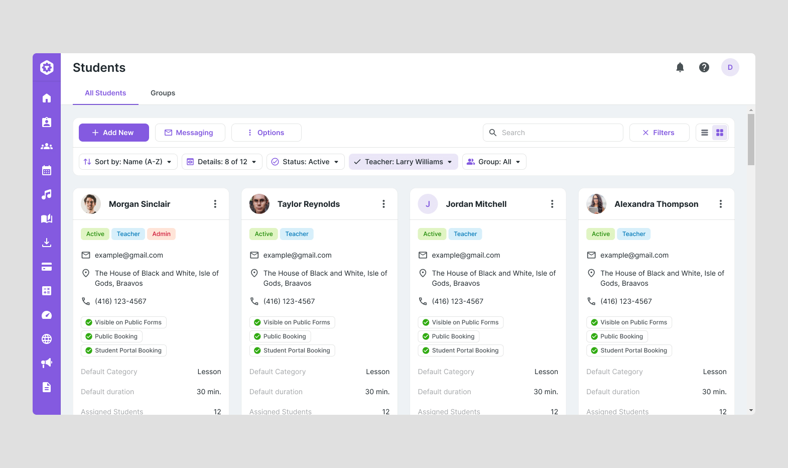
I began exploring ways to simplify the structure and decided to experiment with combining filters and sorting into a single, unified bar — a design pattern already common in many modern products.
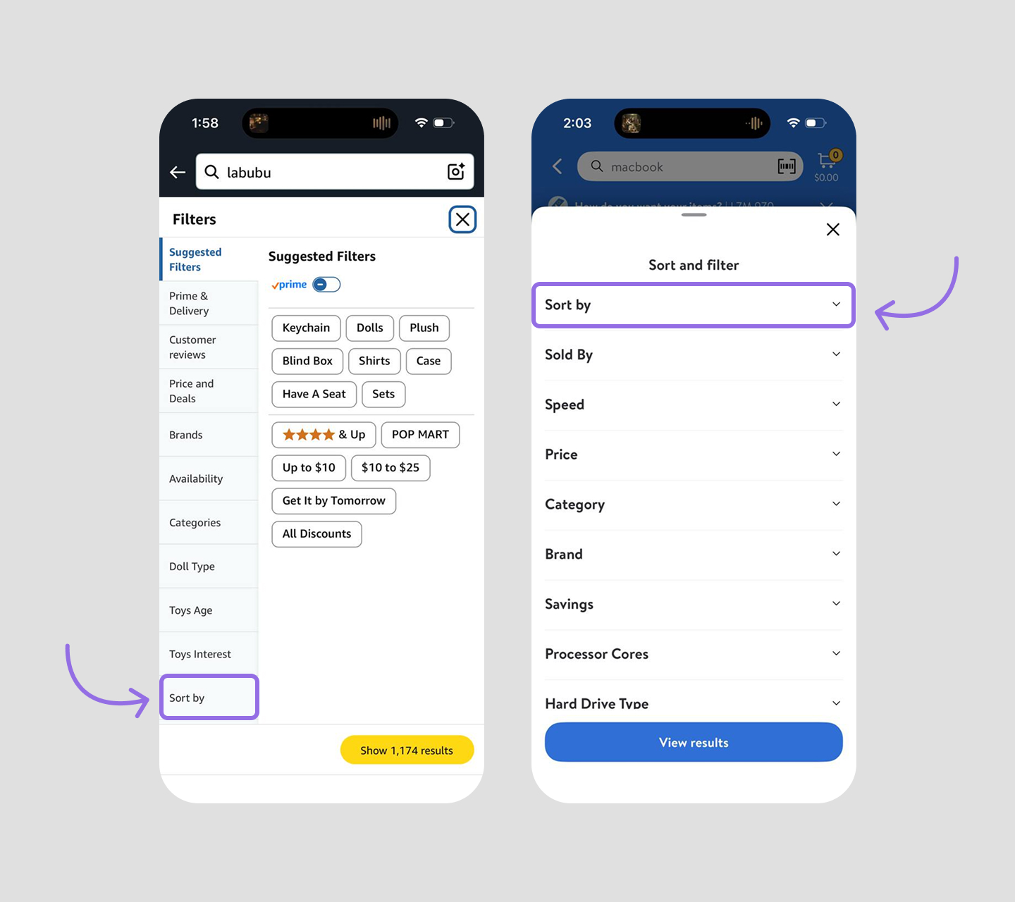
The search field clearly needed to be always visible — it was used far more frequently than filters.
There were a lot of variations explored, but the architectural challenge remained: I still couldn’t find a layout that worked equally well across different types of pages — and at the same time fit compactly on mobile without compromising usability.
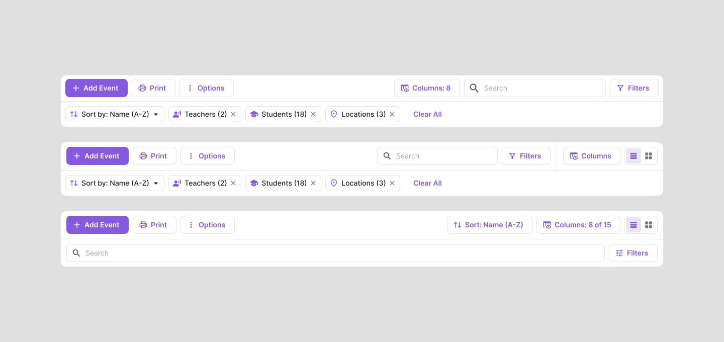
After analyzing how users interacted with the existing filtering system, I realized that they rarely applied many filters at once — in most cases, they used only one to three filters at a time.
This insight made me reconsider my entire approach and rethink what kind of solution would truly match real usage patterns.
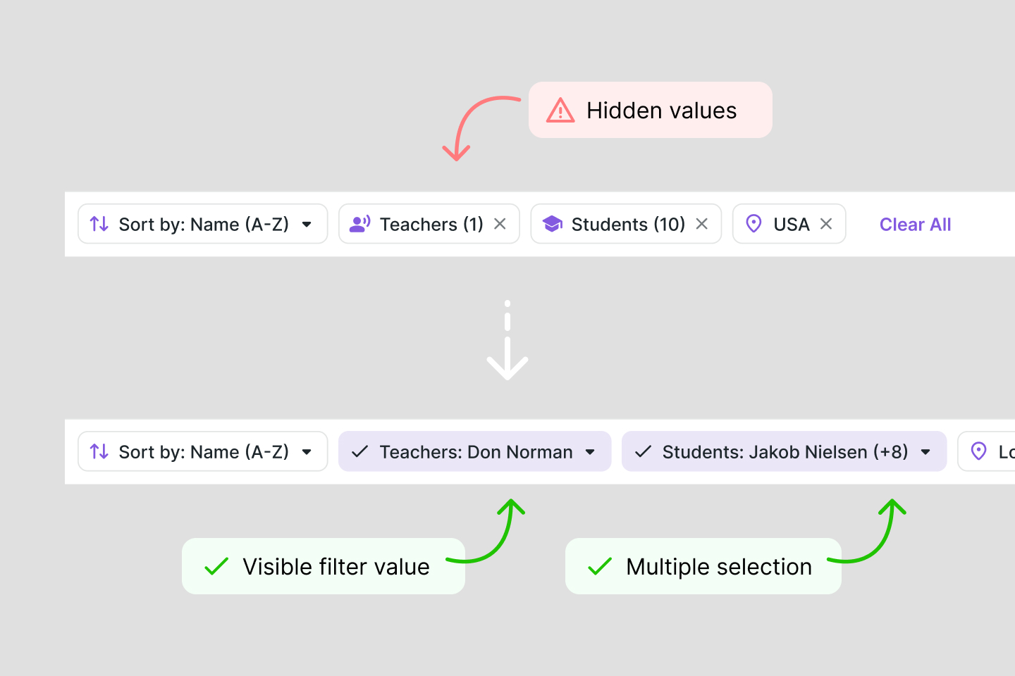
Of course, it was possible to hide the filter labels once they were applied, showing only the selected values — which would make the UI more compact.
But in reality, most pages had only a few filters and enough free space — so it made sense to keep the labels even when filters were active, which improved accessibility and clarity, especially for our target audience.
This approach also allowed me to offload the top action bar by moving table settings and sorting into the filter bar, freeing up space for a permanently visible search field.
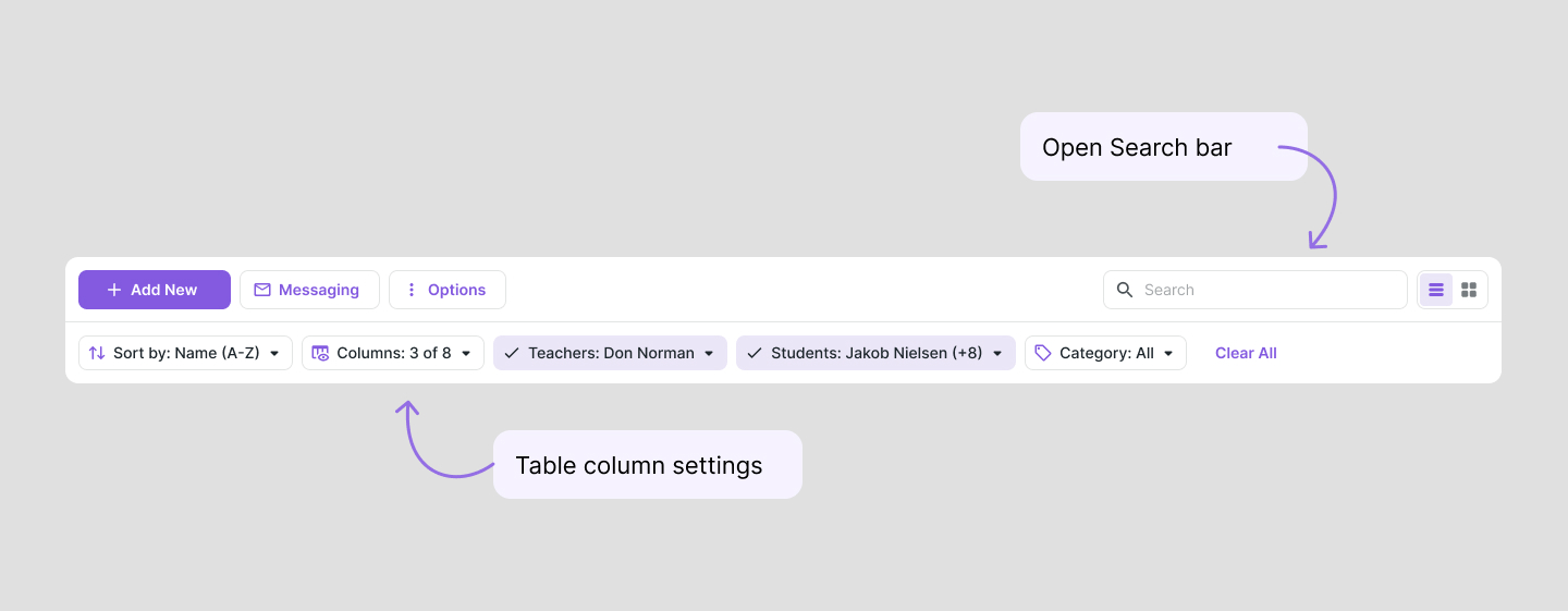
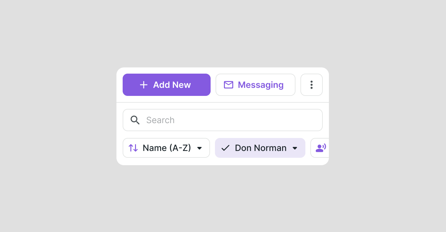
This architecture also significantly improved the mobile experience — the interface became cleaner, more unified, and felt ready for testing.
That said, a few challenges remained. For example, in a drawer layout, this kind of filter construction could feel too heavy or visually overloaded.
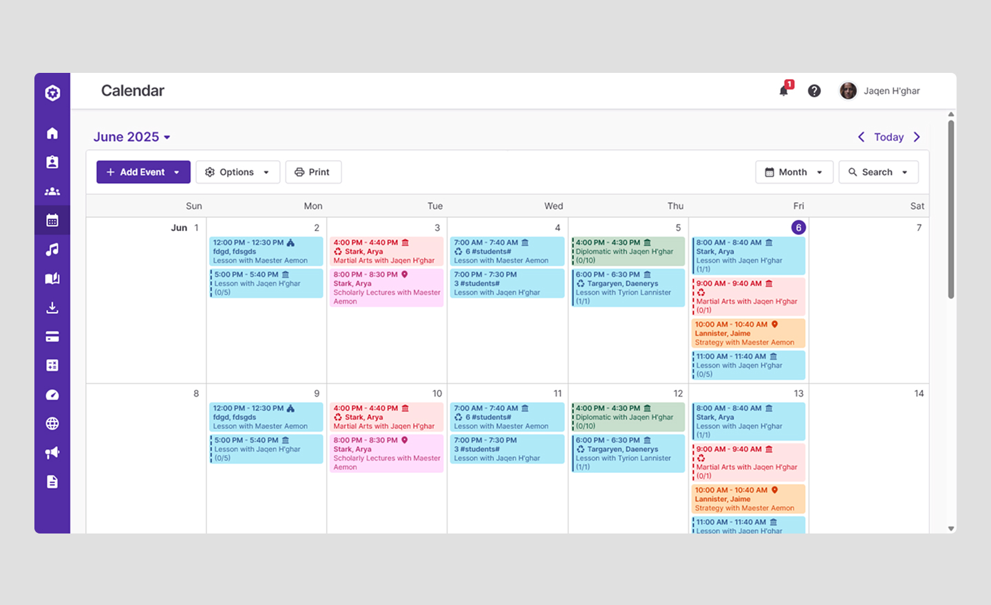
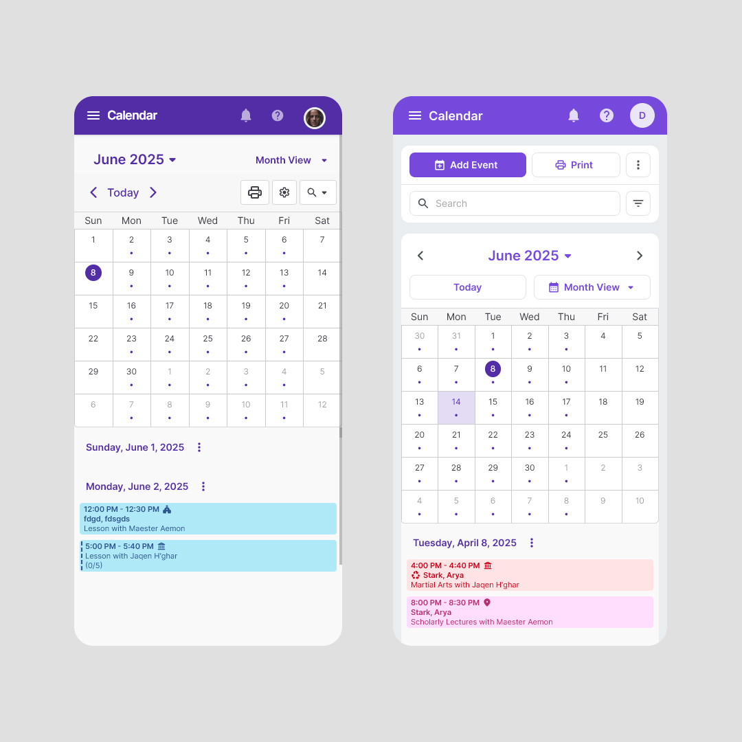
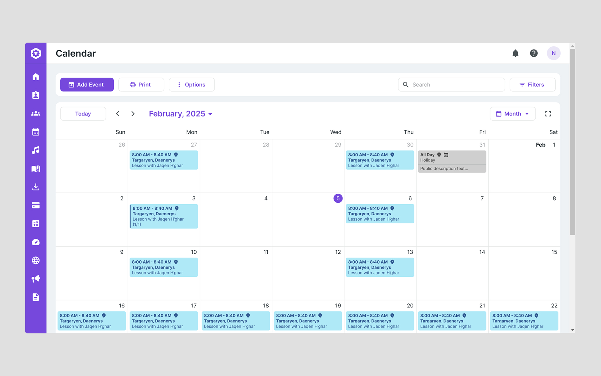
It was even more challenging to unify the calendar interface, since it differed significantly from other pages.
There was no sorting, and instead of table column settings, we had calendar view switching.
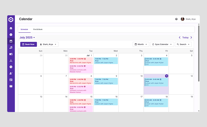
From the student side, the calendar also looked different.
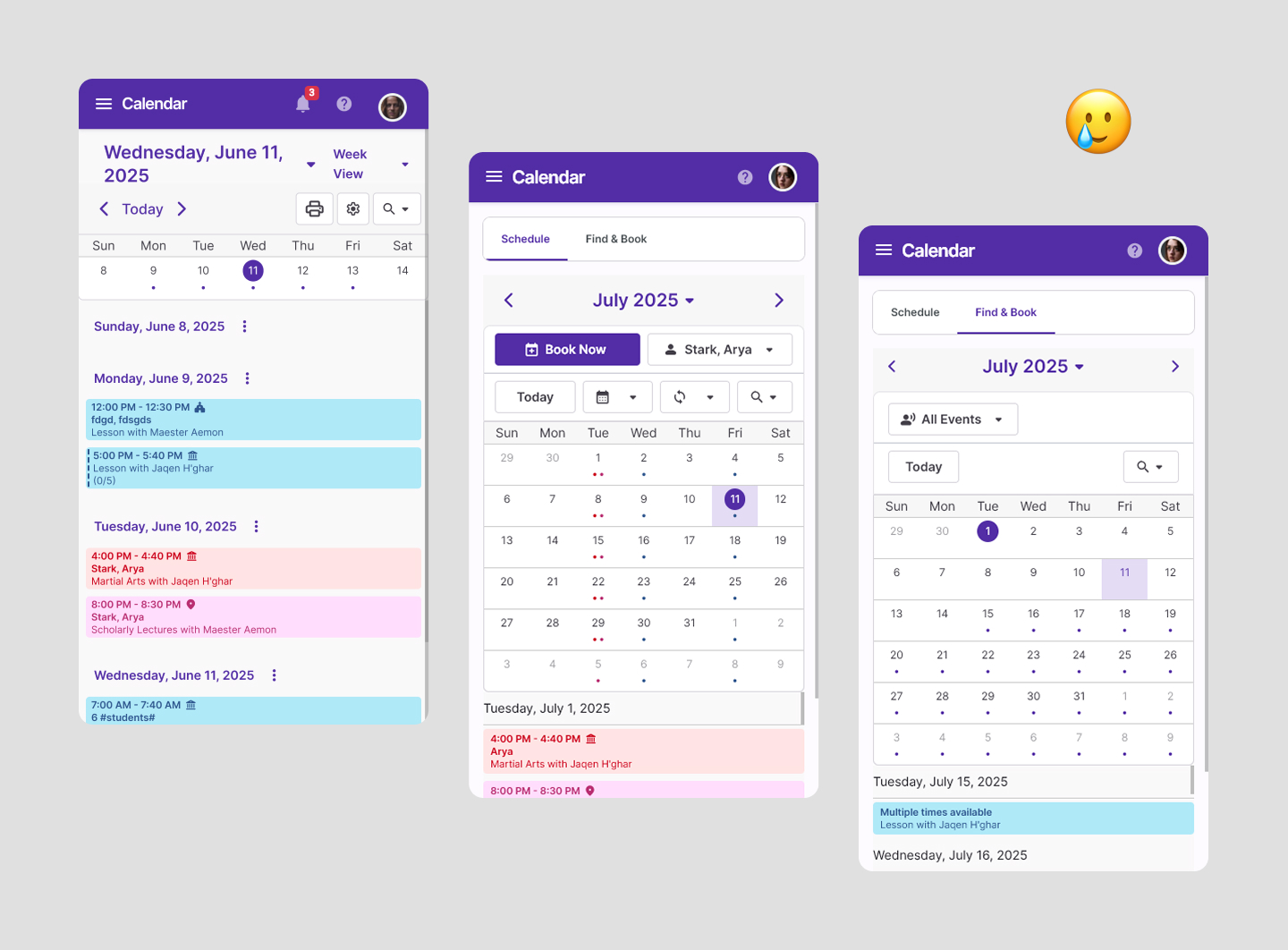
Things got even worse on mobile. It was extremely difficult to achieve consistency — or even just decent design.
Integrating the new filter bar also required:
- Rethinking other elements in the top section of each page.
- Minimizing the size and visual load of the new filter bar.
Solution
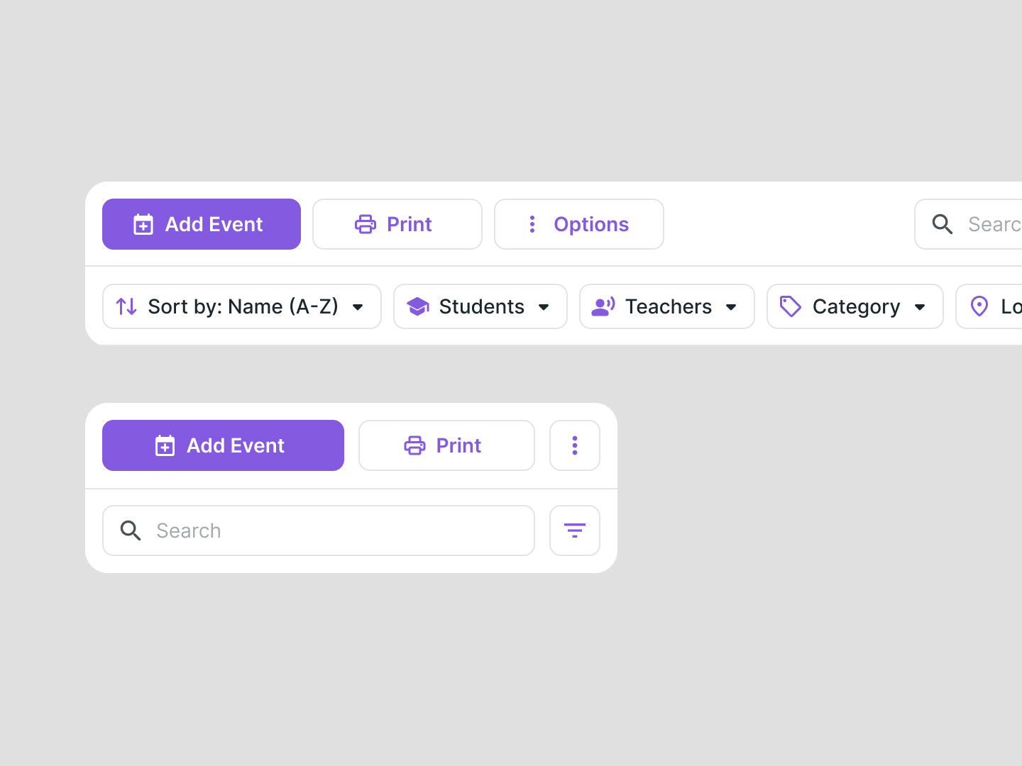
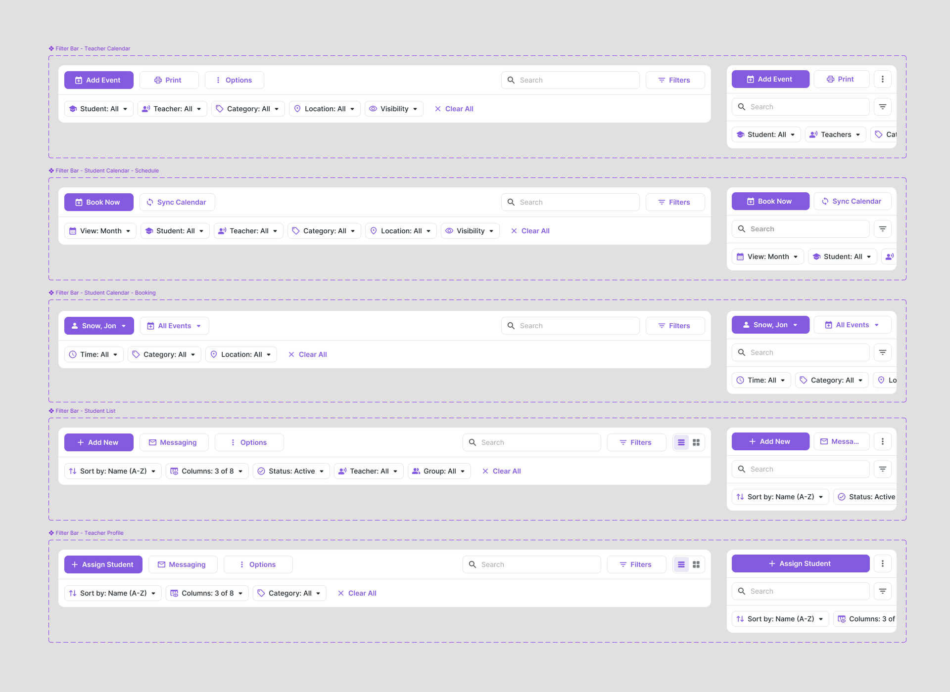
I decided to try adding a “Filters” button. This would allow the panel to be minimized, collapsing filters when not used, or not showing the filter panel at all when there are none — just the search input.
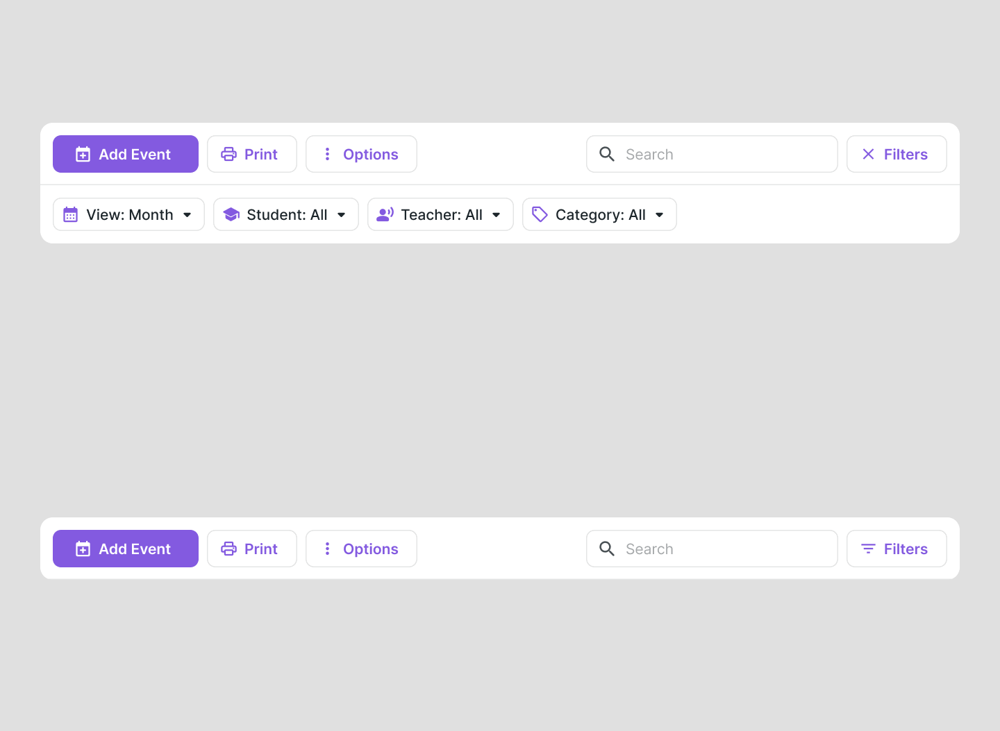
It also allowed us to show the number of active filters directly on the button — something we had done before.

At this point, the filter bar could be considered ready — but I still had to solve the challenge of integrating it seamlessly into the existing interface.
After several iterations, I found a solution that was both intuitive and practical, and fit well into the new architecture of search and filtering.
Conclusion
This wasn’t just a filters redesign — it was a rethink of how people search, sort, and control content across the product.
I created a flexible system that works for tables, calendar, and everything in between — on desktop and mobile. It cleaned up the UI, made filtering clearer, and finally brought consistency across pages.
Now, filters feel connected — especially between Calendar and Attendance. We can even carry over settings between them, like users often asked for.
A small change on the surface — but one that made the product feel more solid, scalable, and easy to use.