

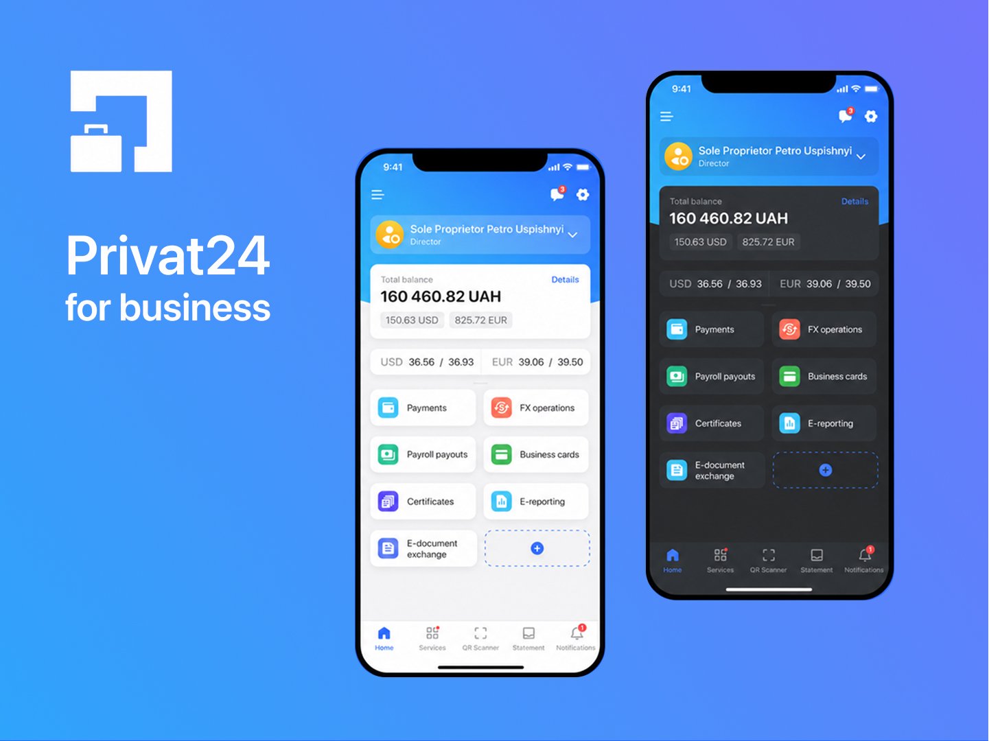
Overview
Privat24 for Business is the mobile banking app PrivatBank offers to legal entities and entrepreneurs — used to manage company accounts, payments, payroll, and reporting on the go.
Role: Senior UI/UX Designer (led the redesign)
Task: Redesign v3.0 of the app with a complete UI & IA rework
Contribution: End-to-end UI & IA redesign, research direction (defined hypotheses and prototypes for the testing team), A/B test setup for key interactions, design system foundations
The problem
The previous version (2.x, 2020–2022) had accumulated real friction for business users, visible directly in App Store / Google Play reviews:
- Authorization — a confusing, multi-step login flow that broke for some users entirely (one 1-star review described being unable to log in at all, hitting a persistent “invalid QR code format” error).
- Navigation — critical actions were buried; one reviewer noted that after an update, saved payment templates disappeared and had to be searched for by date instead.
From research and moderated interviews with business-account holders, three needs kept surfacing:
- A customizable workspace — every business uses the app differently, and a fixed layout wasn’t serving that.
- Management of several companies from one account — many users (accountants, directors) operate more than one legal entity.
- Clear, fast management of payment accounts — current, currency, and deposit accounts, with statements and transaction history.
On top of the functional needs, the product itself needed a stronger identity: a new design system built to scale, and support for light/dark theme.
Process
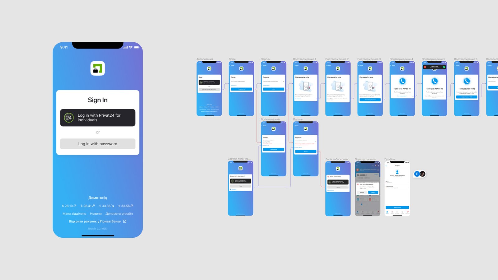
Mapping the login flow. Authorization was the single biggest pain point, so the first step was laying out the entire flow end-to-end — every branch: signing in via personal Privat24 vs. business login, password recovery, SMS/phone confirmation steps, blocked-login handling. Seeing it mapped out end-to-end made clear how many of the drop-off points were unnecessary branching rather than actual security requirements.
Moderated research with a dedicated testing team. Throughout the redesign, a testing team ran surveys and moderated user interviews, and tested prototypes directly with real business users for usability. That work is what surfaced the customer needs above and validated design directions before they got built.
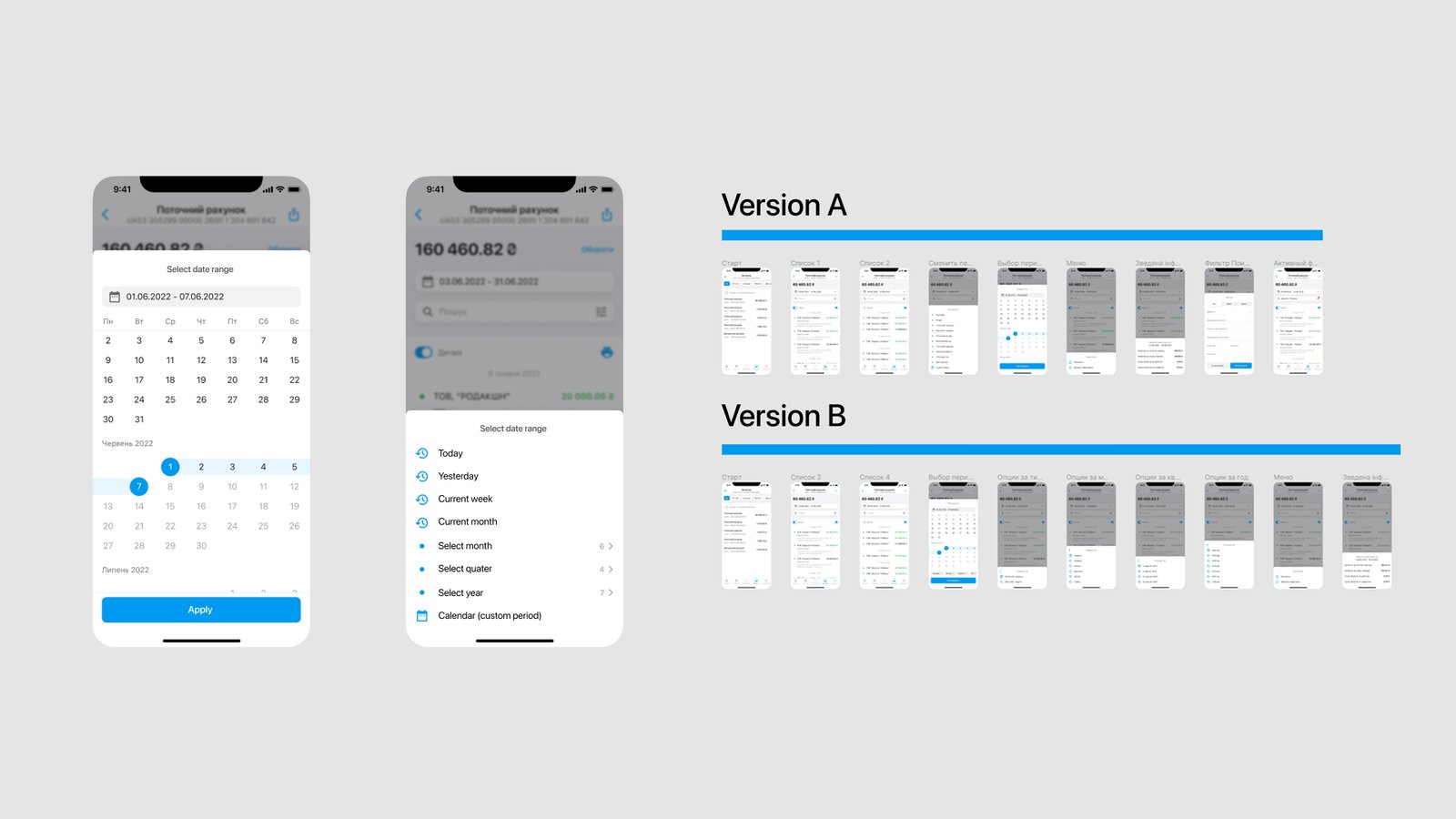
A/B testing key interactions. For screens with real ambiguity in how to solve them — the account-statement date filter, in particular — two competing prototypes were tested against each other (calendar-first vs. quick-preset periods like “today / this week / this quarter”) rather than guessing which pattern business users would want.
Solution
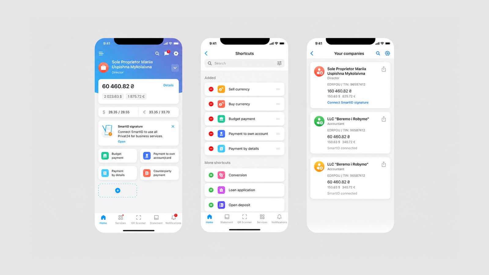
Navigation & quick actions. A dedicated shortcuts panel surfaces the actions a business actually uses often — currency sale/purchase, budget payments, payments to own accounts, payments by requisites — instead of forcing users through the same generic menu every time.
Customizable home workspace. The home screen reorganizes around the account balance and the actions relevant to that business, with room to add more shortcuts as needed, rather than a fixed one-size-fits-all grid.
Multi-company management. Users managing more than one legal entity (a common case — the same accountant handling a sole proprietorship and an LLC, for example) can see all their companies at a glance, each with its own balance, role (Director / Bookkeeper), registration details, and connection status (e.g. SmartID), and switch between them without leaving the flow they’re in.
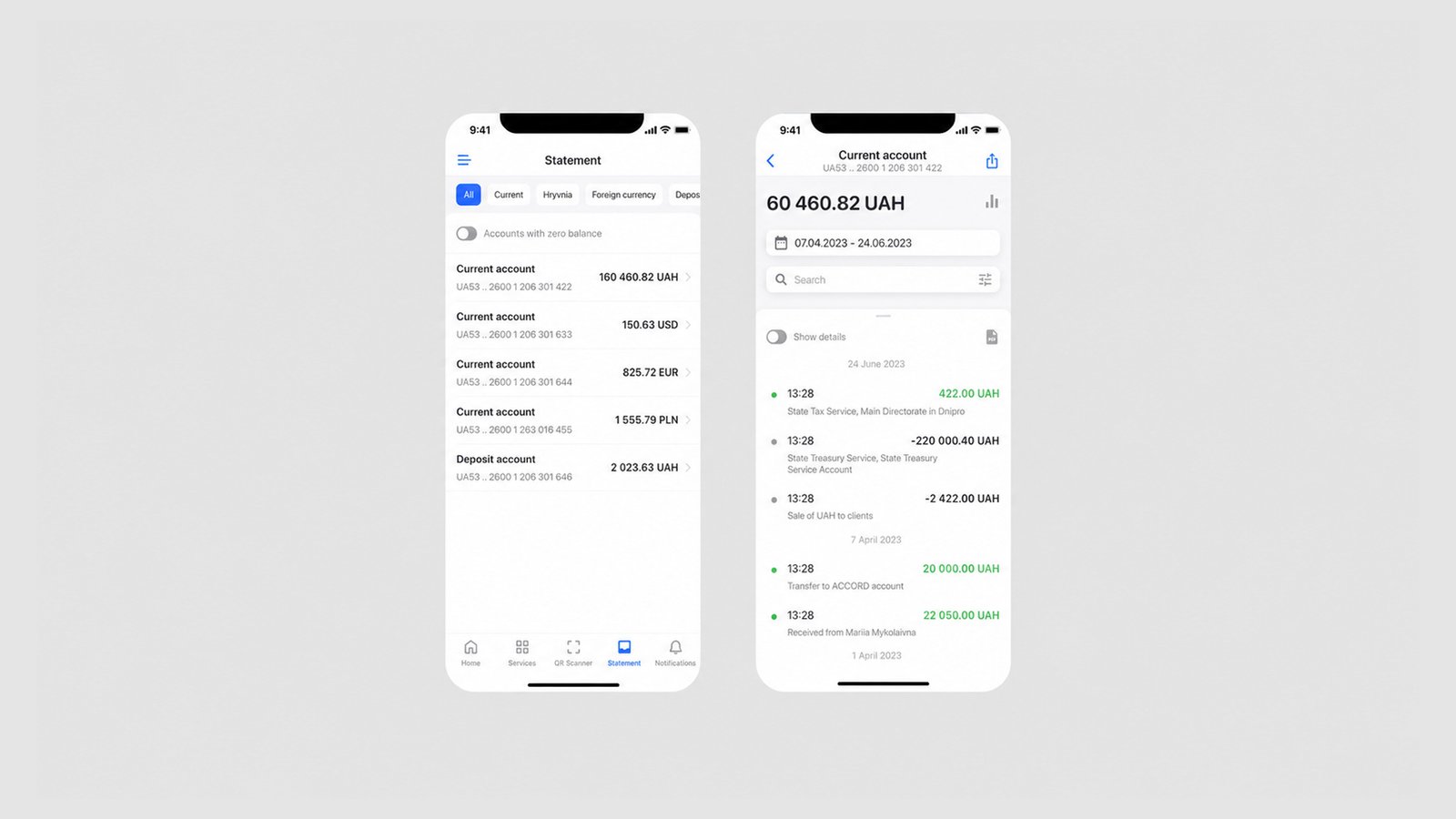
Payment accounts & statements. A single, filterable view of every account type — current, currency, deposit — with balances up front, and a detailed transaction history per account (searchable, filterable by period, with income/expense clearly color-coded).
Testing outcome. The A/B test on the period-selection UI validated combining both approaches: quick presets (today, this week, this month, custom quarter/year) for the common case, with a full calendar available for anything custom — rather than shipping just one or the other.
Results
The redesigned v3.0 shipped, and the impact showed up both in growth and in how users talked about the app:
- +134K new active clients — PrivatBank reported a 41% increase in active users within a year of launch.
- App Store: 4.7 (561 ratings)
- Google Play: 4.6 (25.9k reviews), 1M+ downloads
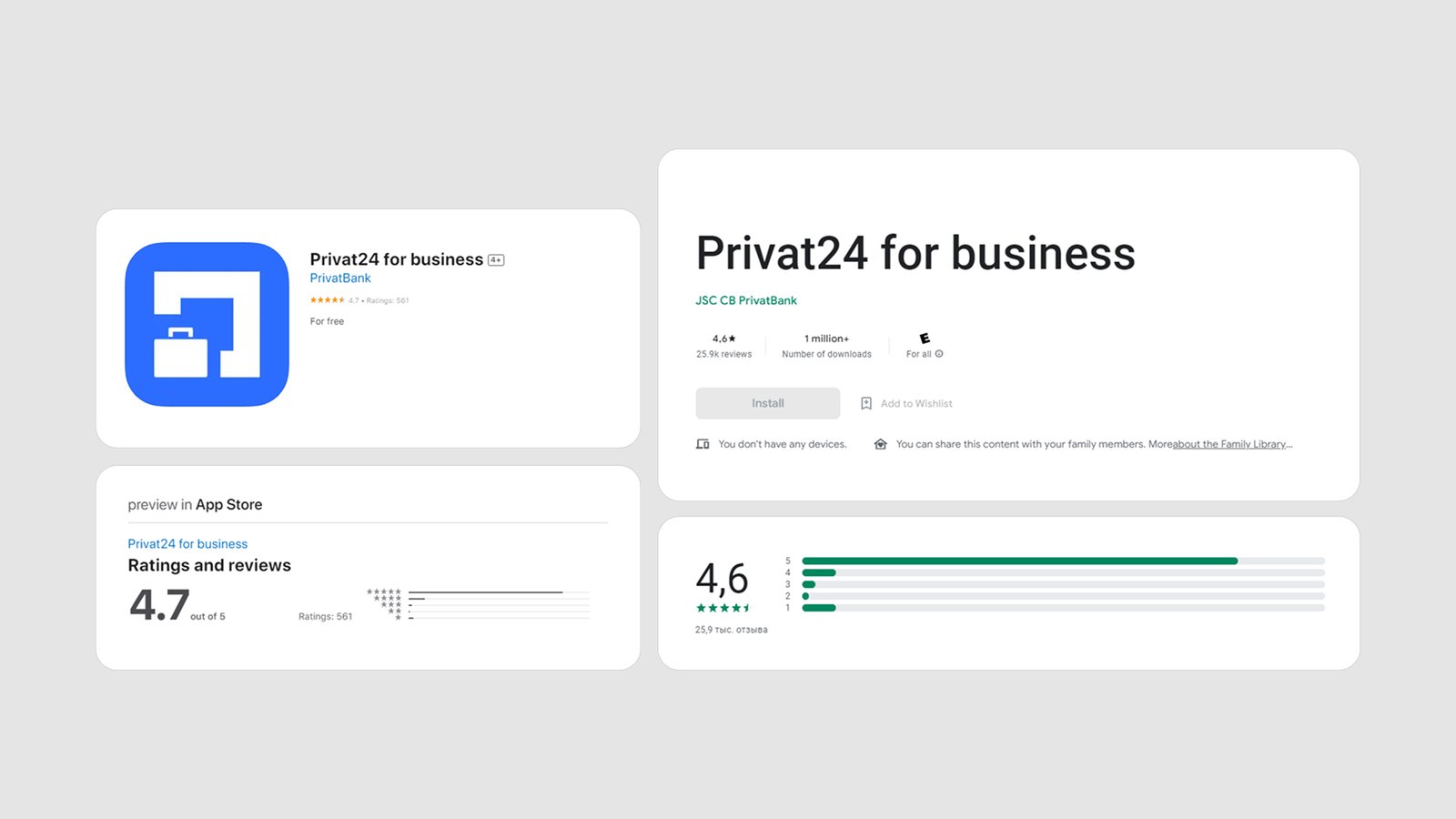
Before, reviews described broken flows and frustration (“Terrible bank and terrible app! … It’s impossible to log in with a registered account”).
After the redesign, the tone flipped — “Very simple and convenient”, “Great app! Lightweight, intuitive to use. Support responds fast and explains the next steps clearly” — with PrivatBank support actively replying to reviews, which reads as a healthier feedback loop overall, not just a UI polish.