

Role: Product Designer
Client: Atlancia — a wholesale distributor of medical supplies, equipment, and mobility products, serving pharmacies, clinics, and healthcare businesses across Canada
Overview
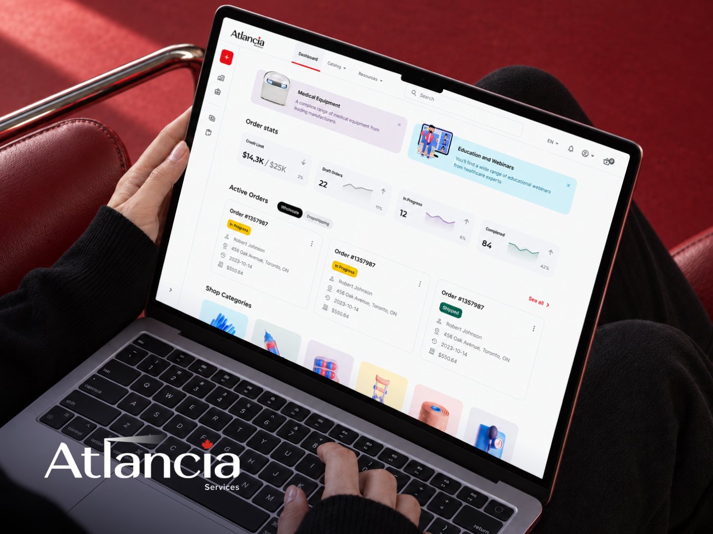
I turned Atlancia’s mismatched, hand-patched storefront into a self-serve B2B wholesale platform built to handle account applications, credit-based payment terms, and recurring business orders end to end.
Atlancia’s customers are pharmacies, clinics, and other healthcare buyers who need to apply for an account, order under credit terms, and manage recurring purchases across a team.
The old site didn’t reflect any of that.
It had been built on top of a generic storefront template and extended over time with one-off, hardcoded fixes rather than a consistent system — the layouts were inconsistent, the patterns were non-standard, and there were clear gaps in both the UX and the underlying architecture, on top of missing the account, credit, and order-management infrastructure a real B2B buyer needs.
The redesign also landed in the middle of a bigger change — the company was mid-rebrand, which meant the new site couldn’t just inherit an existing visual identity.
The Problem
The brief actually started with a name. For years the company had operated as BestBuy Medical Supplies Inc. — and the resemblance to Best Buy, the electronics retail giant, was working against them
The mix-up was one of the reasons they decided to rebrand outright and relaunch as Atlancia. This redesign was commissioned as part of that relaunch, which added a layer most redesigns don’t have: the new brand’s visual identity wasn’t fully locked yet.
There was a new name and a new logo — a mark built around a red leaf — but no accent color, no visual system, nothing to just apply to a template.

On top of that, the brief split into two connected issues.
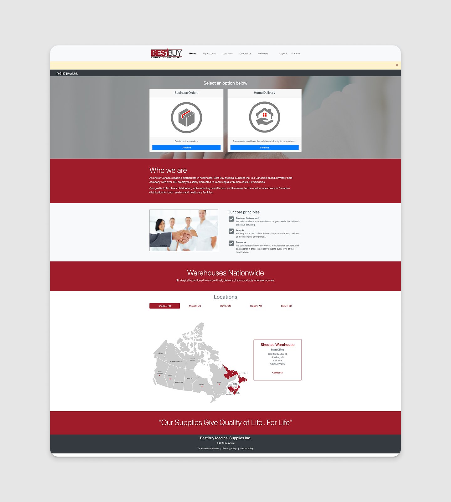
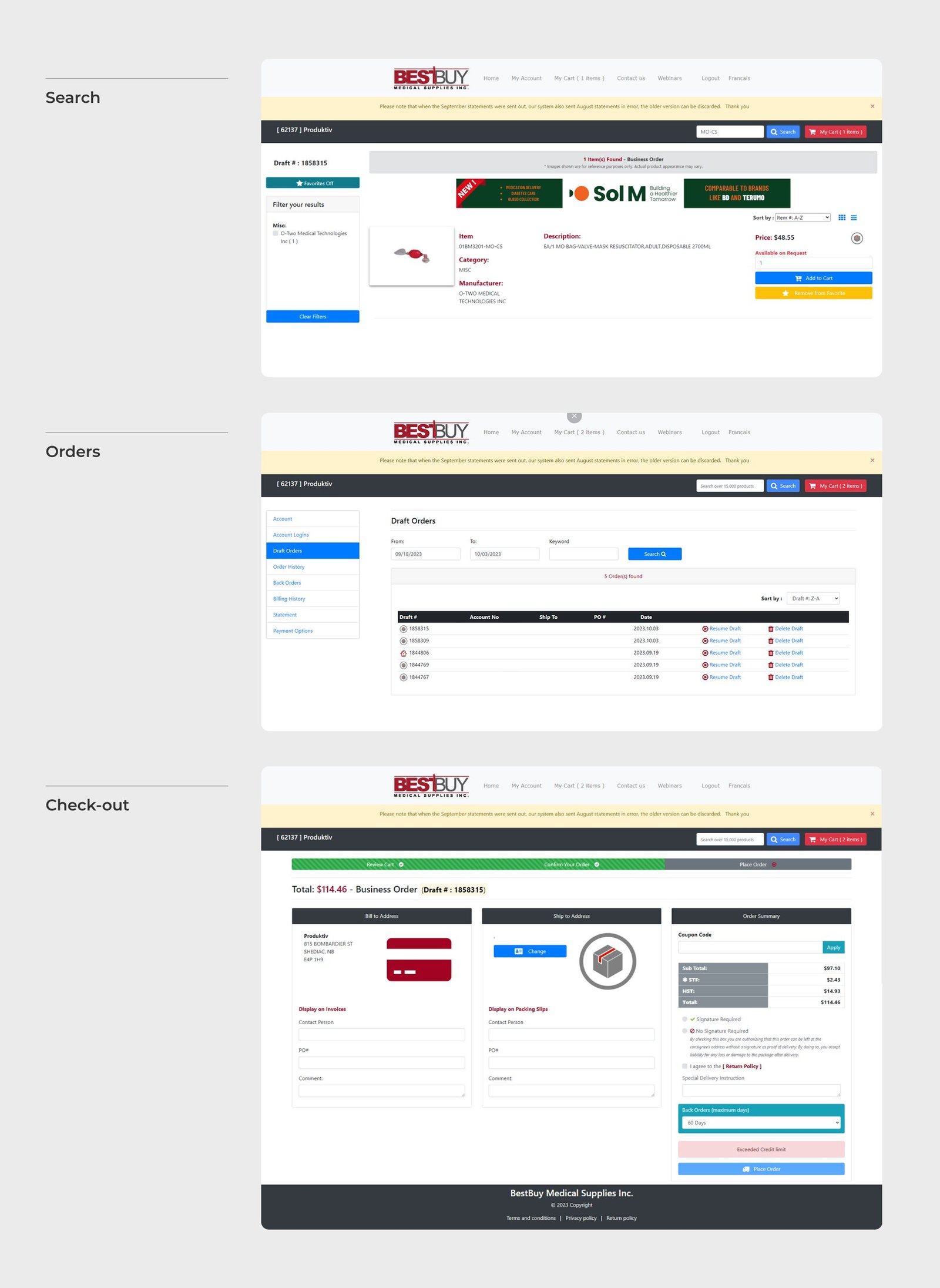
The first was visual: the existing site — captured here from the actual BestBuy Medical Supplies pages we audited — was a leftover from an earlier, generic e-commerce template: stock hero photography, default red/maroon color-blocking, clearance-style banner ads, a layout that could have belonged to almost any online store.
The second was structural, and it mattered more: there wasn’t really a wholesale ordering system behind the storefront. A real B2B buyer needs to apply for an account and get approved, order under business credit terms, split purchases between “for my clinic” and “for resale,” track multiple in-progress orders at once, and manage who on their team has purchasing access.
Solving it meant building the site’s actual backbone from the ground up.
Process
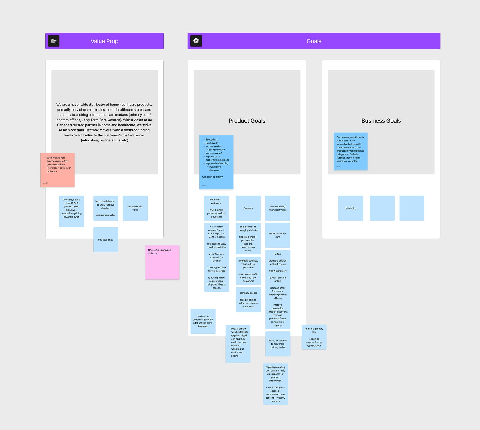
Before any wireframe went up, I ran a structured UX audit of the existing platform and mapped Atlancia’s own product and business goals — what the redesign needed to achieve for the client and users.
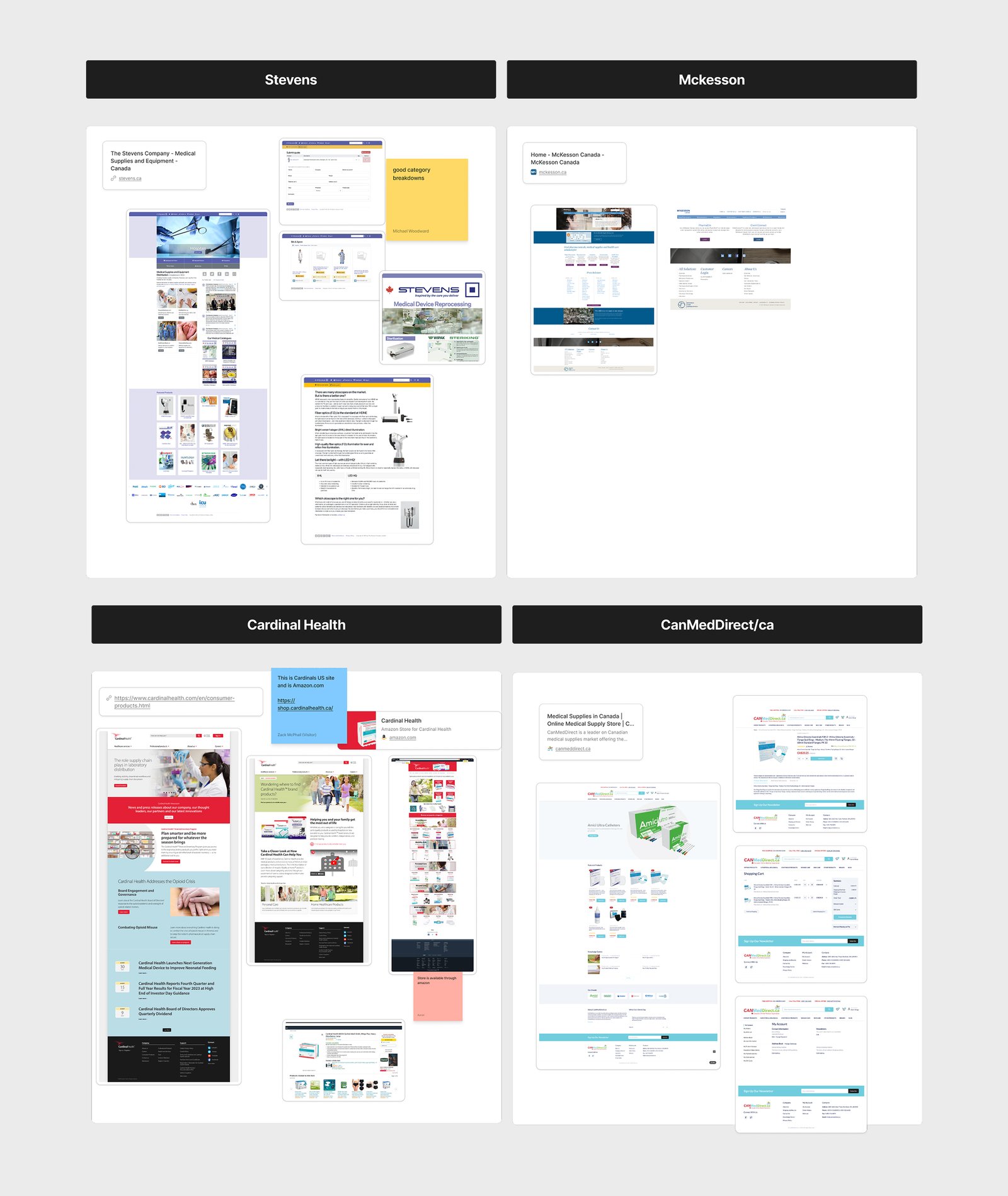
Next I audited competing Canadian medical-supply distributors, to see how Atlancia’s storefront actually stacked up against the market it was competing in. None of them read as built for a vetted, credentialed buyer either — all four defaulted to generic, dense multi-category storefronts, the same visual problem Atlancia had. That gap is what the visual-direction work below leaned into: credibility as a real medical distributor.
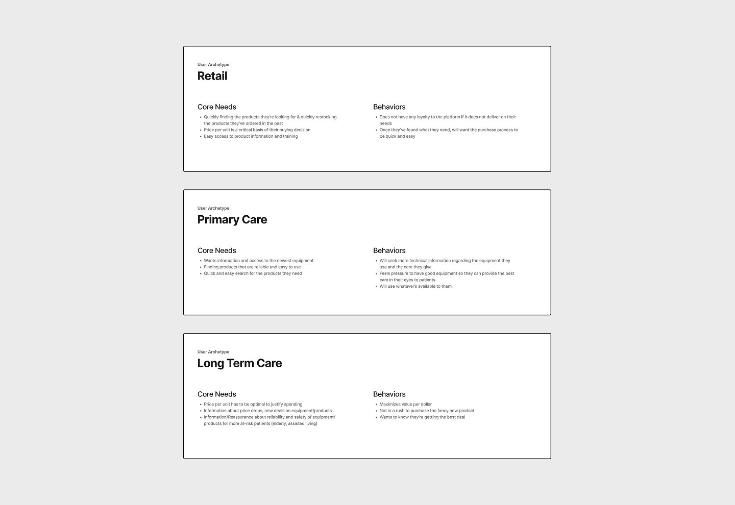
That fed into three buyer personas — retail pharmacy owners/managers, primary-care clinics and doctors’ offices, and long-term-care facilities — each with different pain points and different ways of finding a supplier in the first place (mostly word of mouth and sales-rep referrals).
That research surfaced four recurring problems, which I wrote up as a set of prioritized next steps:
- Sign-up itself was a barrier — customers couldn’t create an account themselves; they had to request one and wait for approval.
- Order management was scattered across separate pages instead of living in one dashboard.
- Search and filtering couldn’t keep up with the size of the catalog.
- Product listings gave almost no detail to help a buyer decide.
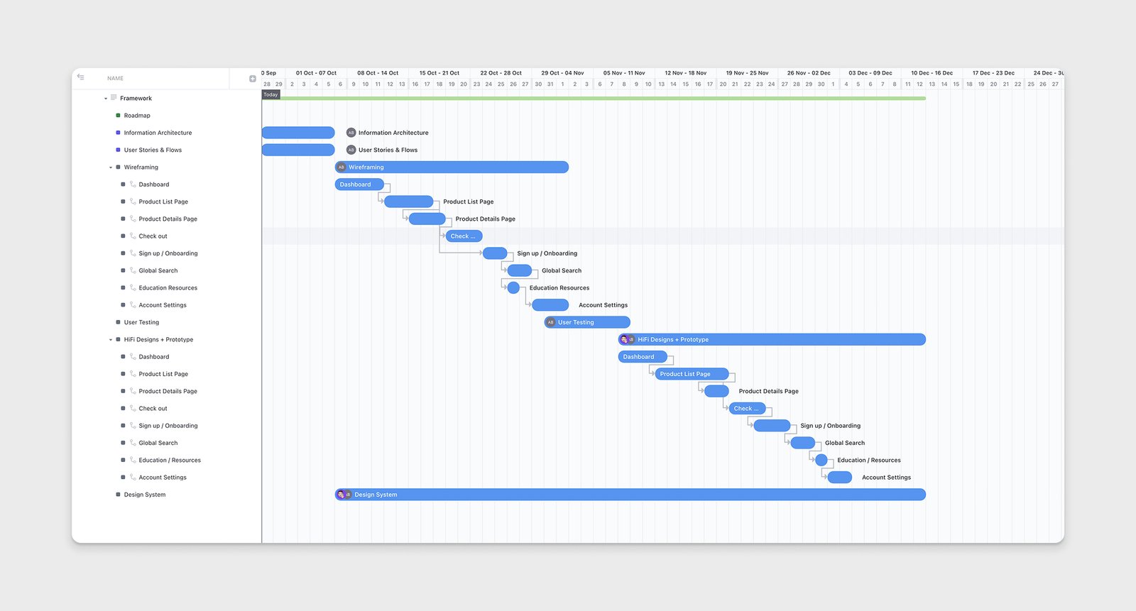
The audit closed out with a roadmap that sequenced the actual work — information architecture and user flows first, then wireframes, then hi-fi design and a shared component system.
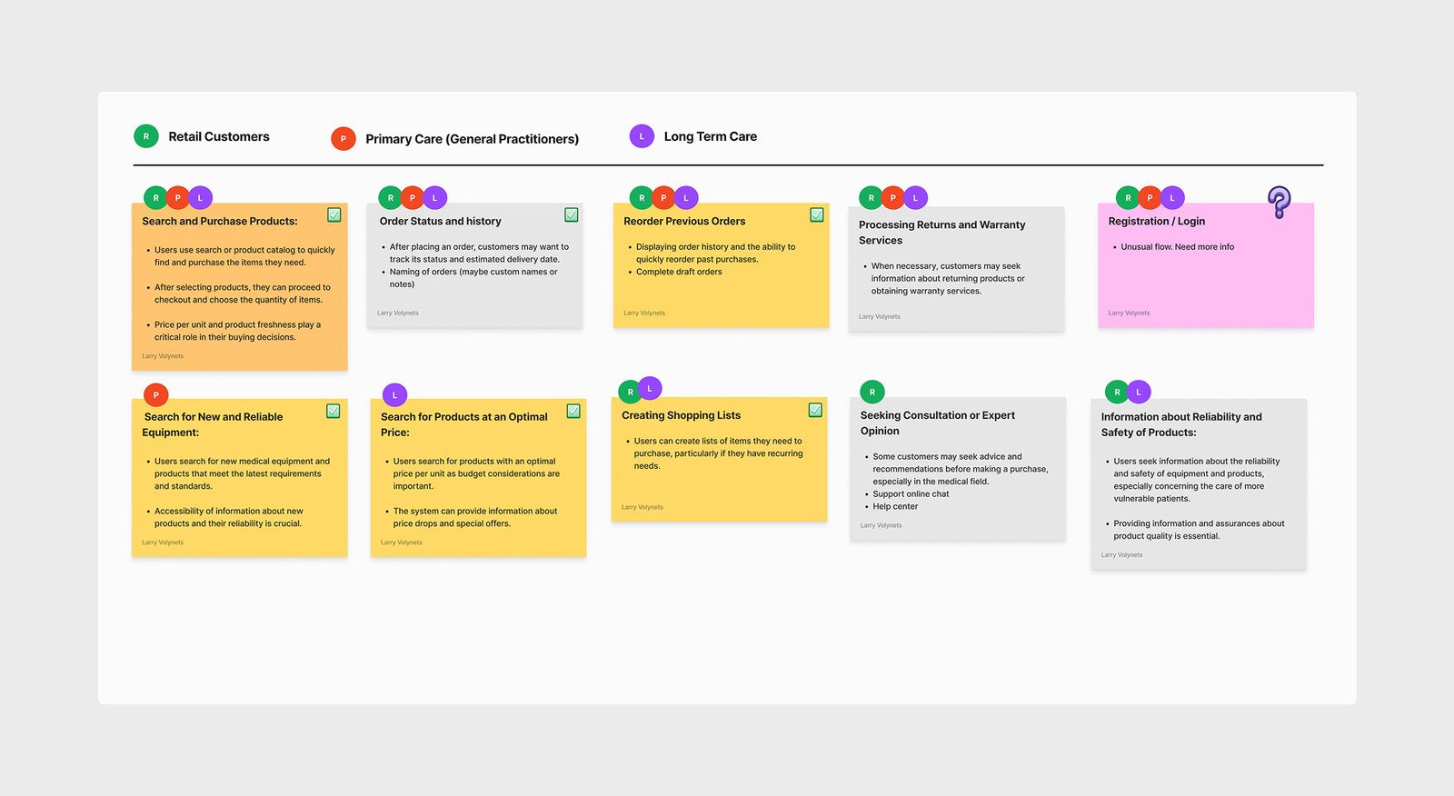
From the personas, I also wrote up concrete user stories mapped to which segment each applied to — reordering previous orders, creating shopping lists, seeking consultation before buying, and so on — and flagged the ones that weren’t well-defined yet.
Rebuilding the IA
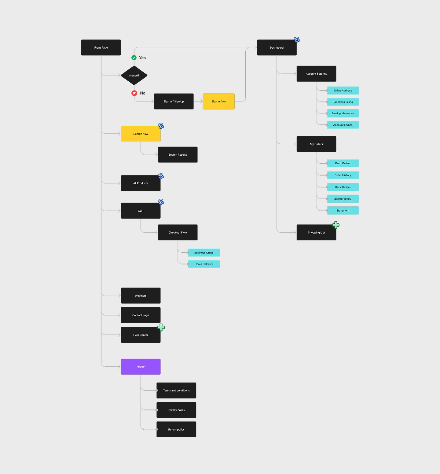
Mapping the whole flow — sign-in, search and checkout, order management, account settings — surfaced a real gap: the credit application had nowhere to live in the old structure, a hole significant enough that it became its own section (see “Registration & credit application” in the Solution below). The shopping list and a dedicated help center earned their place the same way, pulled straight from the user stories. This diagram became the actual scope document for the rebuild.
This diagram became the actual scope document for the rebuild.
Establishing the visual direction
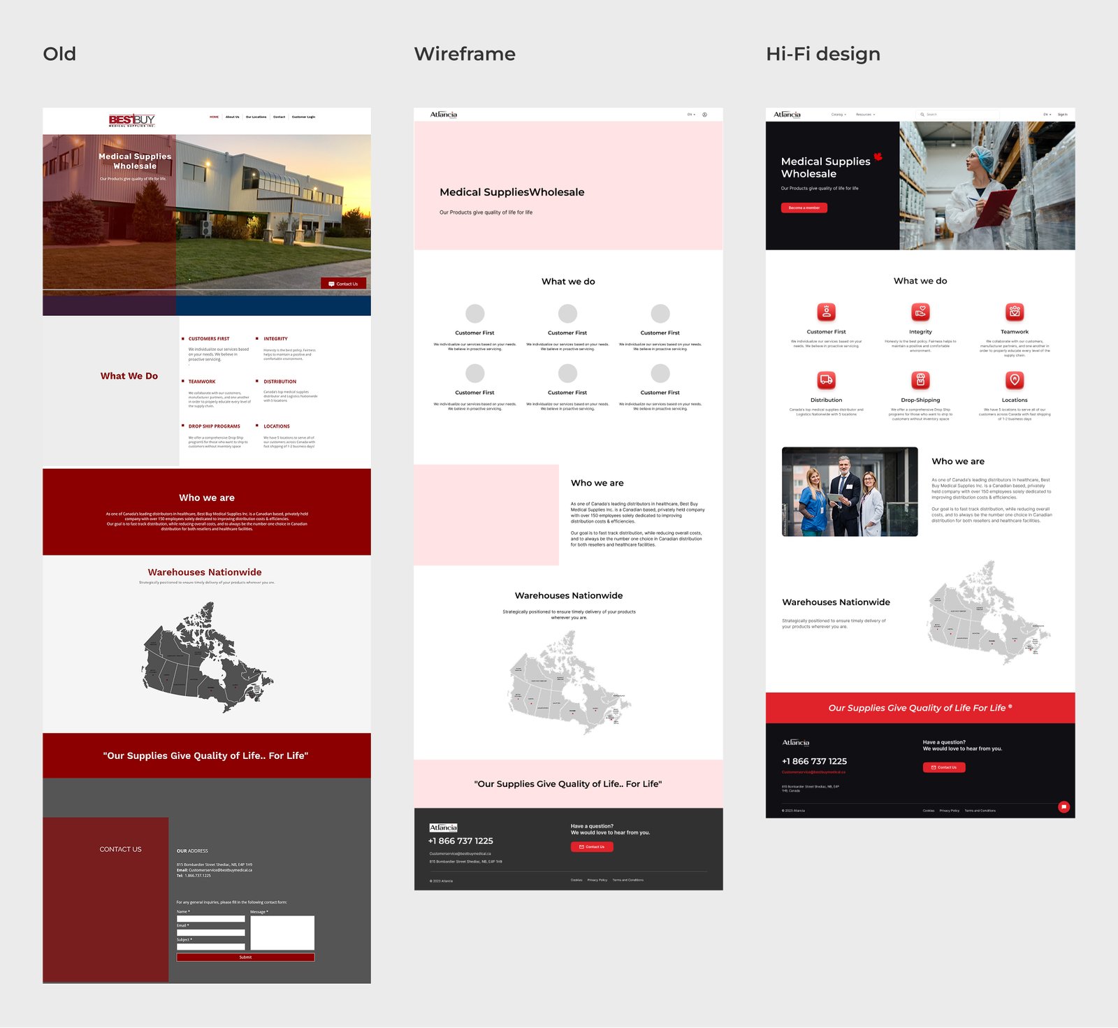
For the core landing experience, I worked through the full progression: the original page as the baseline, a low-fidelity wireframe to lock the new structure, then a hi-fi direction that paired a calmer navy header with real photography and iconography, replacing the generic stock blocks and old maroon color-blocking.
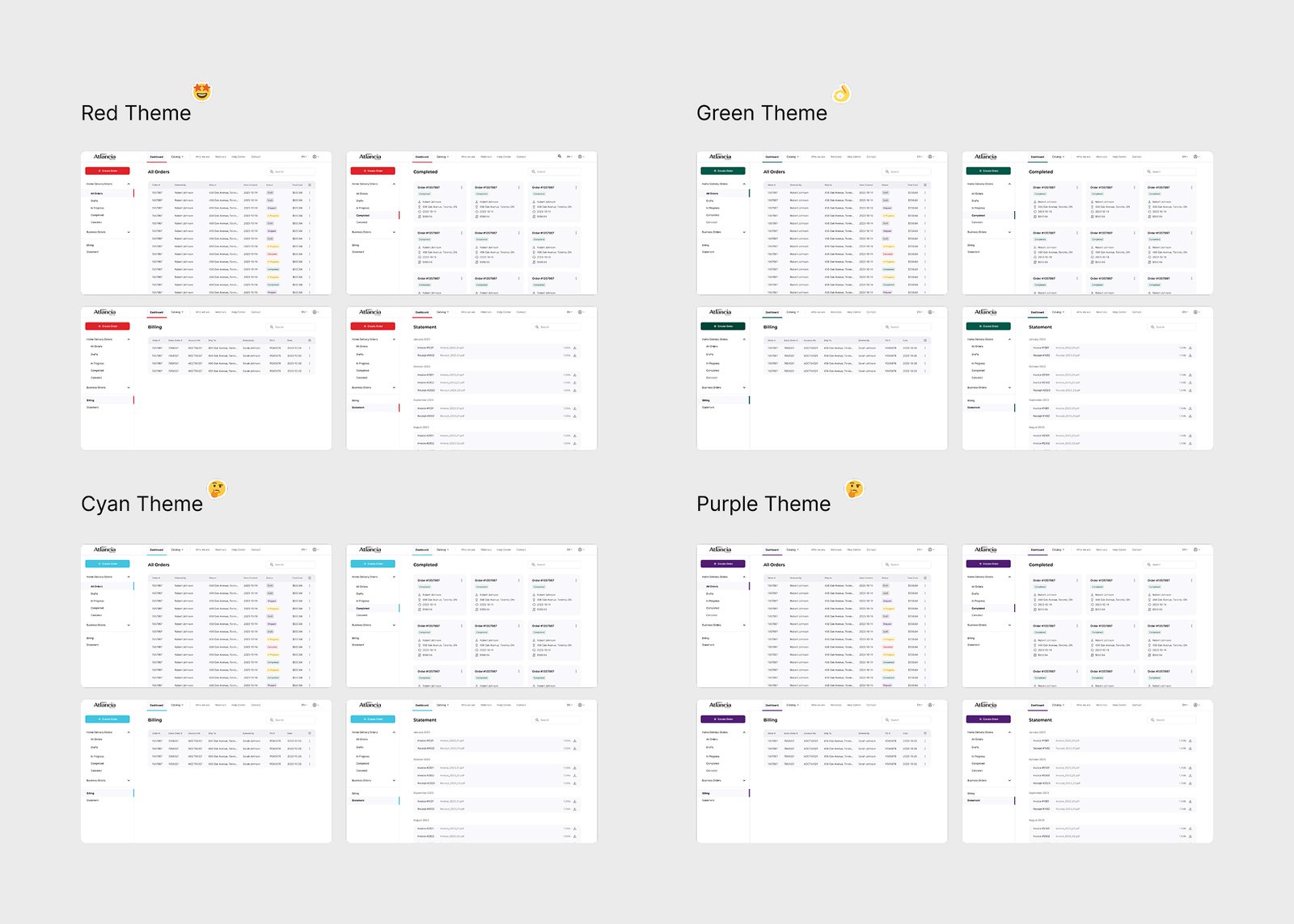
Because this project doubled as a brand relaunch, several decisions here were brand decisions as much as page decisions. The new logo was built around a red leaf, and the rebrand came with four possible accent colors.
I mocked the site up in each so the client could see them side by side — the rebrand was too fresh to skip that step, even though red was the clear fit from the start: it read as medical without being clinical, and it was a color the new brand could immediately own.
A calmer navy took the header and chrome around it, so the accent had something quiet to stand out against.
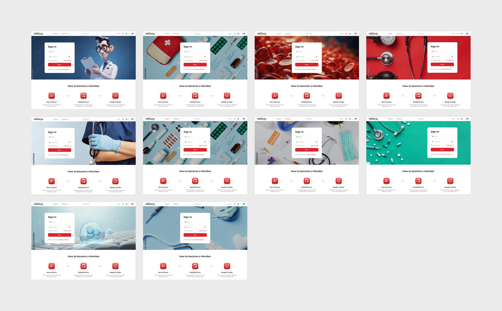
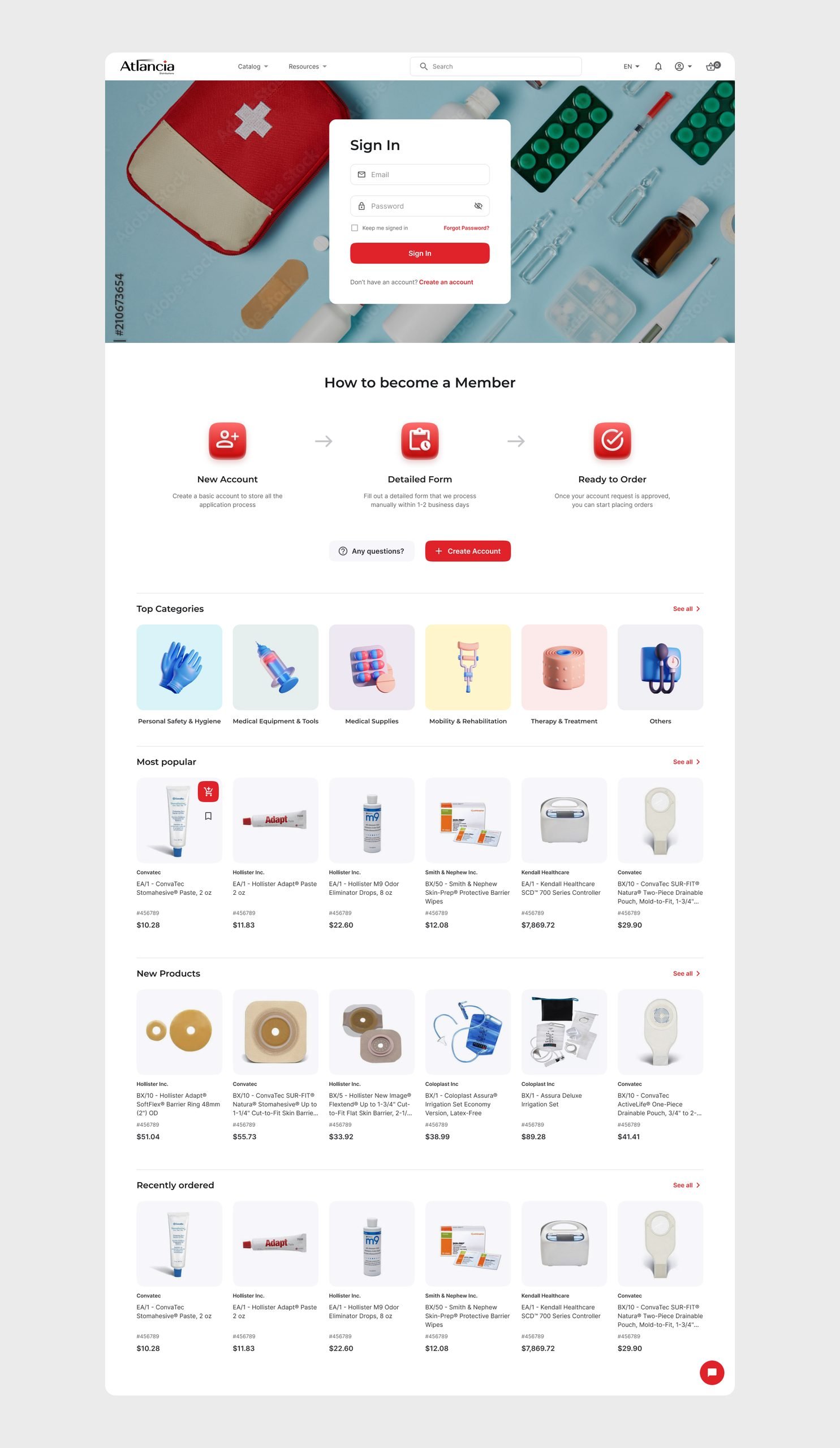
I also explored the platform’s pre-login front page — what a signed-out visitor lands on, with the Sign In card, a “How to Become a Member” walkthrough, and product-browsing sections underneath — against ten different background photo treatments behind that same structure, from clinical photography to product close-ups to illustration, to find a tone that read as credible without feeling cold.
The final layout centers the sign-in card over a full-bleed photo because the client’s own site data showed account access was the single most-searched-for thing on the site — the composition puts the form itself at the visual center, with the photography working as atmosphere behind it.
The Solution
Designing the dashboard from scratch
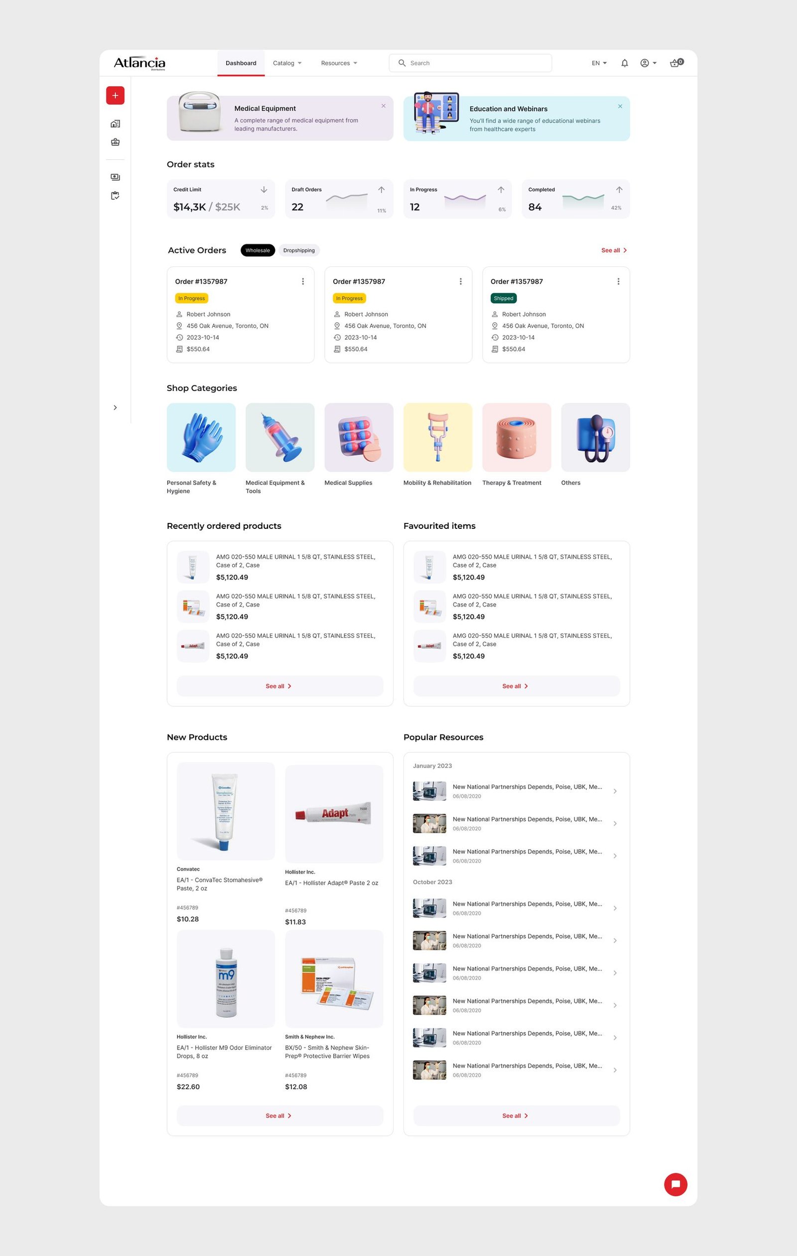
The old IA had no dashboard at all — this was one of the four problems the research flagged, and a returning buyer had no single place to check where their orders stood.
I designed it in from nothing, taking it through several rounds of client review (the sticky notes are still visible on some of the earlier frames) before landing on order stats and a recent-orders list, shop-category shortcuts split by product line, and curated New Products / New Webinars rows that give a returning buyer something to act on beyond checking status.
It also had to hold up empty — a newly approved account starts at a $0 credit limit with no order history — so the same layout scales from a blank first login to a full order history without either end feeling broken.
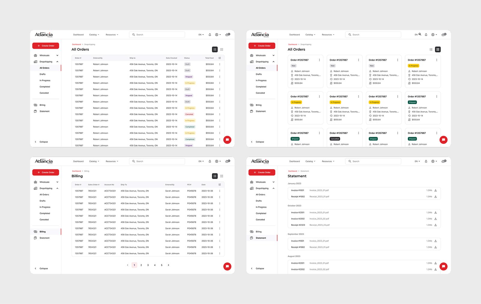
Orders split by type — Home Delivery vs. Business Orders — and by status: drafts, in progress, completed, cancelled, so a returning buyer can see exactly where every open order stands without digging.
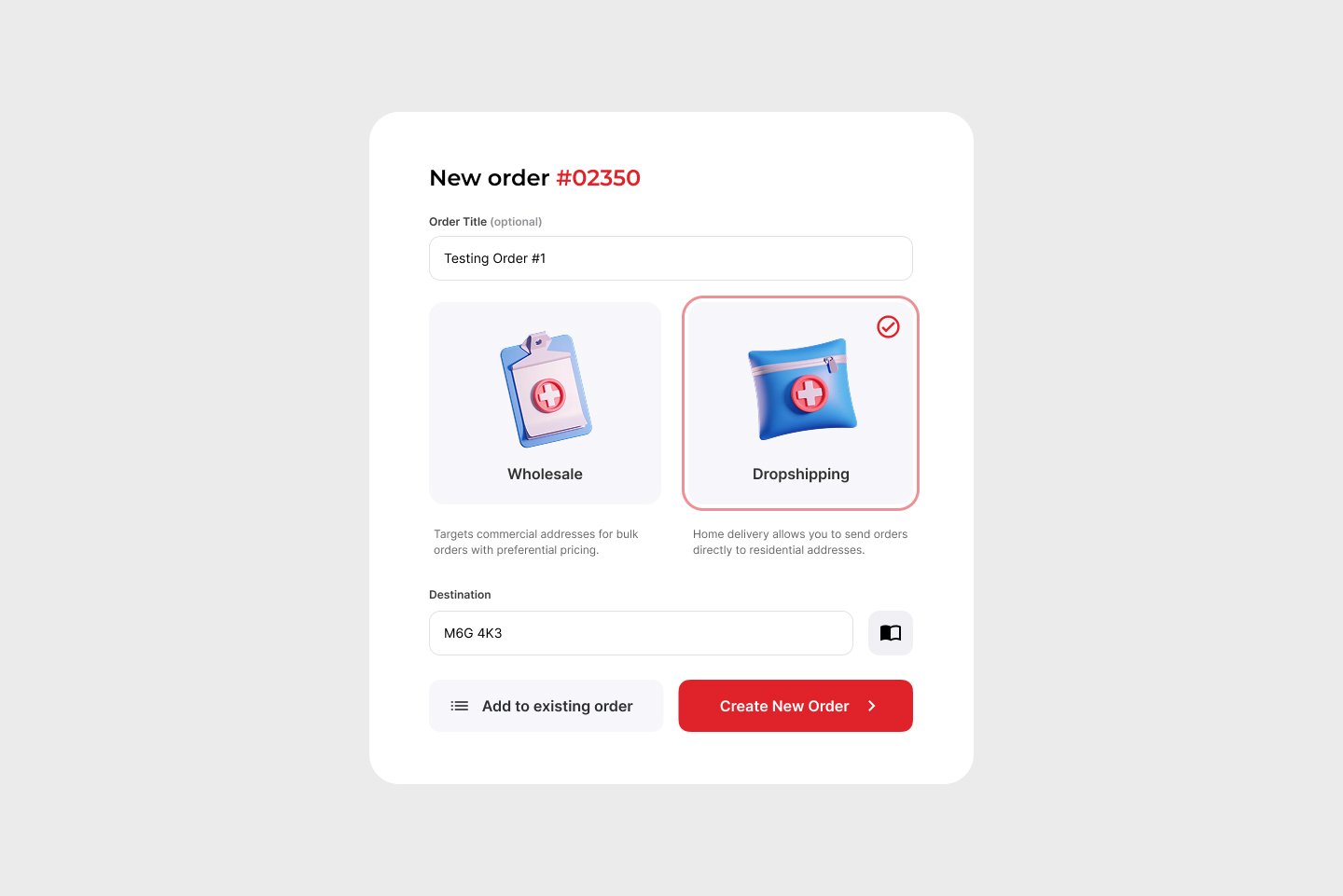
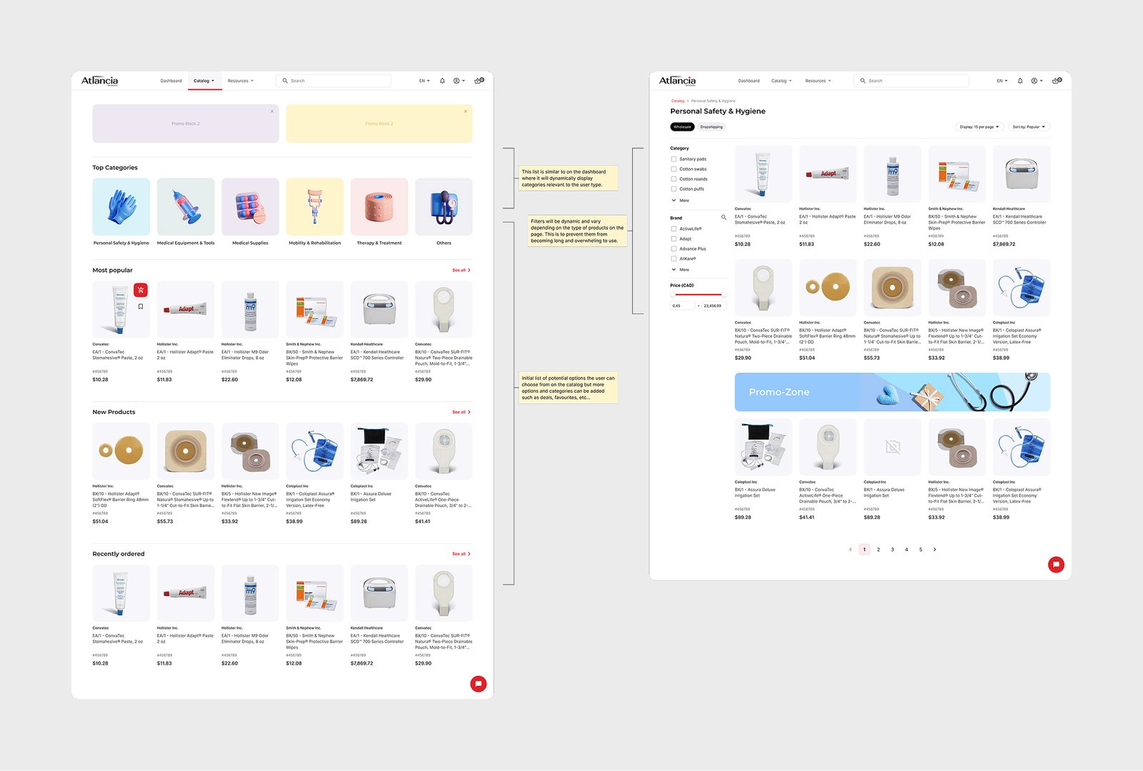
Catalog & browsing. Products are organized by category (Personal Safety & Hygiene, Medical Equipment & Tools, Mobility & Rehabilitation, and more), with filtering by brand and price, and a persistent toggle between Wholesale and Dropshipping — because Atlancia’s buyers place both kinds of orders and need to know which pricing and terms apply before they add anything to a cart.
That category and filter structure is also the direct fix for one of the four problems the research surfaced: search and filtering that couldn’t keep up with the size of the catalog.
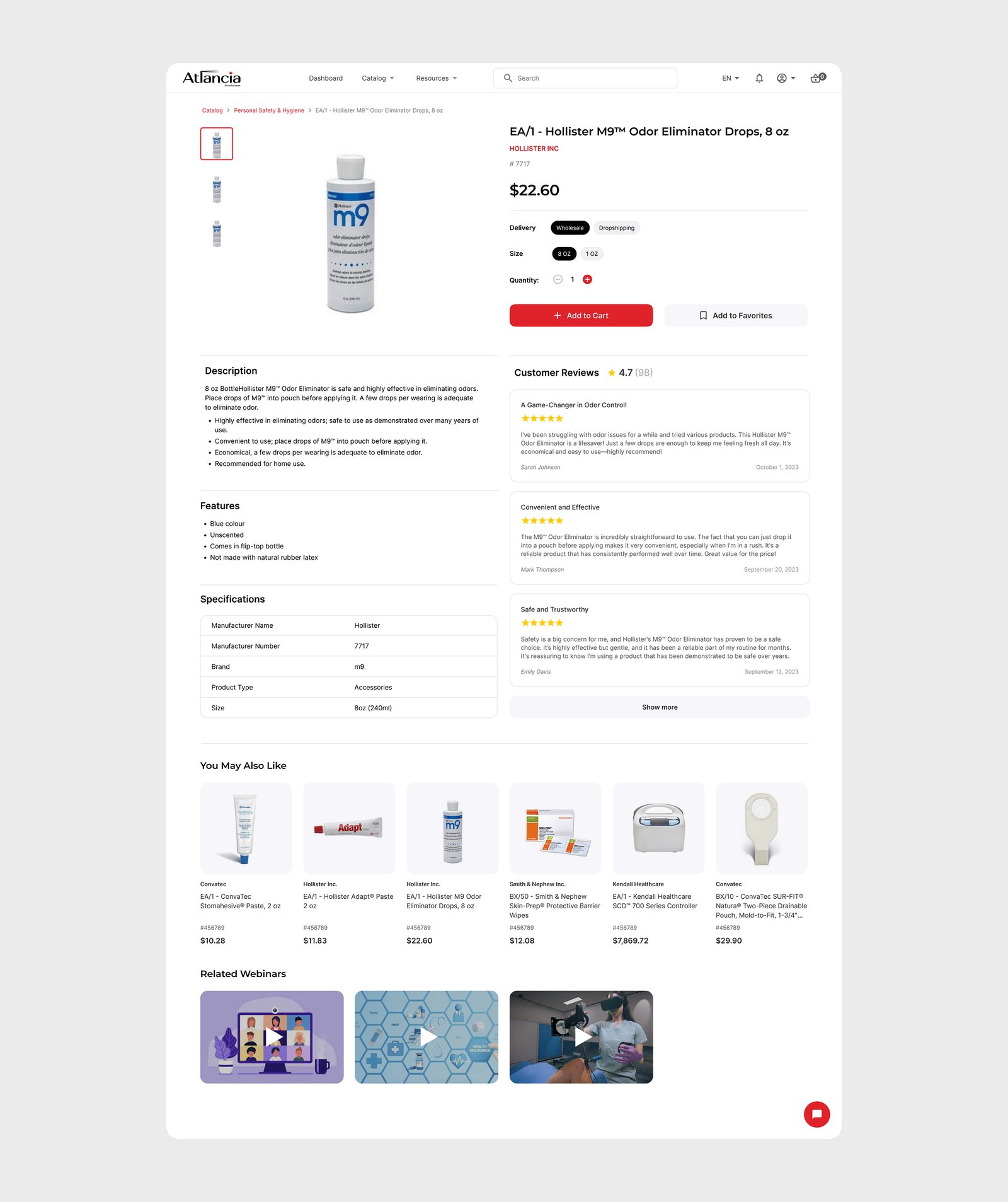
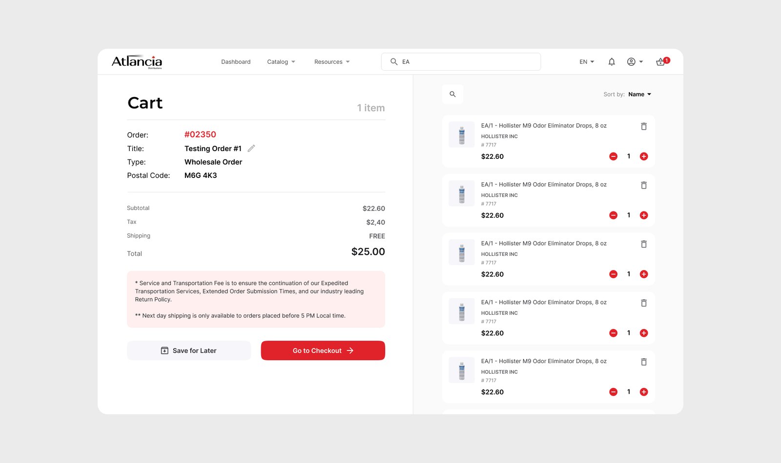
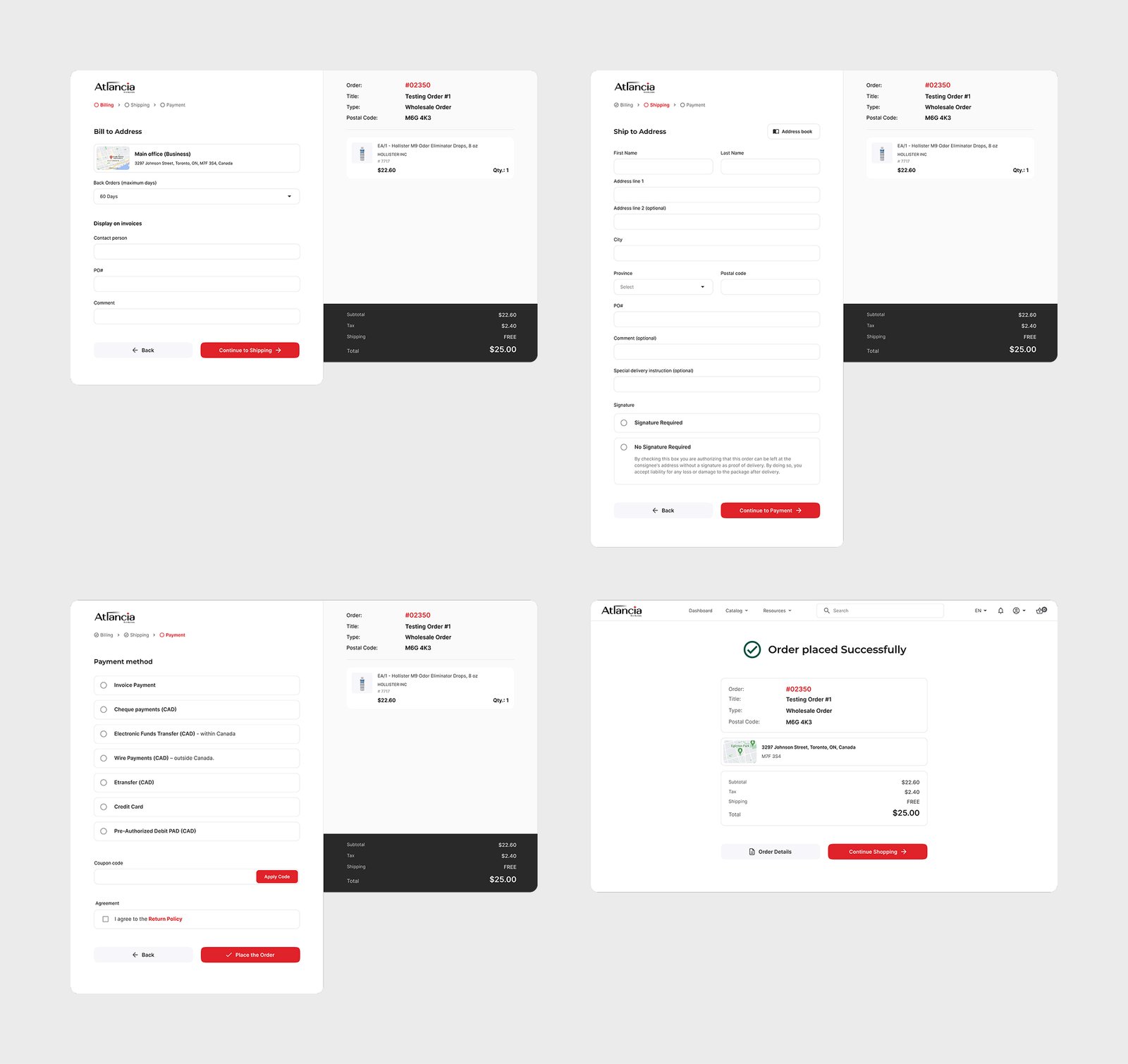
Cart & checkout. Checkout runs through billing, shipping, and payment as distinct steps, and the payment step reflects how B2B medical distributors actually get paid: invoice, cheque, EFT, wire transfer, e-transfer, credit card, and Pre-Authorized Debit (PAD). Shipping carries B2B-specific detail too: back-order windows, signature requirements, and delivery instructions per order.
Stress-testing the flows
Static comps don’t show whether an order-type mismatch or a multi-step checkout actually holds together end to end.
I built a click-through Order Flow prototype — choosing Home Delivery, Wholesale, or Dropshipping, hitting a mismatch warning, watching the cart update live, and running checkout through to success.
Search followed the same interaction pattern under the hood. Wiring screens together this way surfaced edge cases, like adding a wholesale-only product to a home-delivery order, that a static review would have missed.
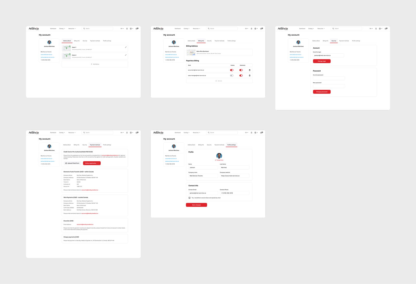
Account management. Address book, billing info, security, payment methods, and business profile all live under one account area — including the ability to add or remove other users by email, since purchasing on a business account is rarely a one-person job.
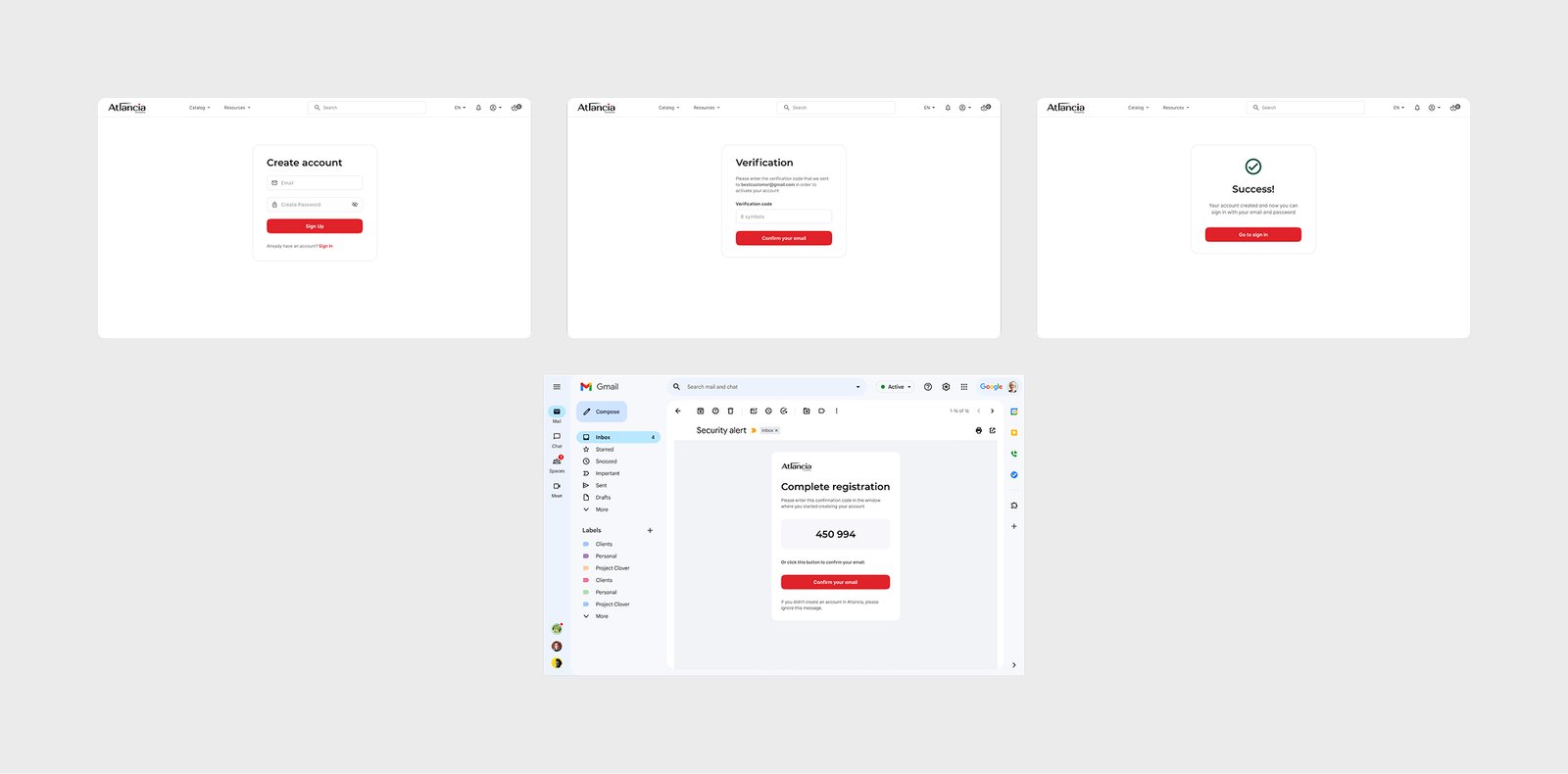
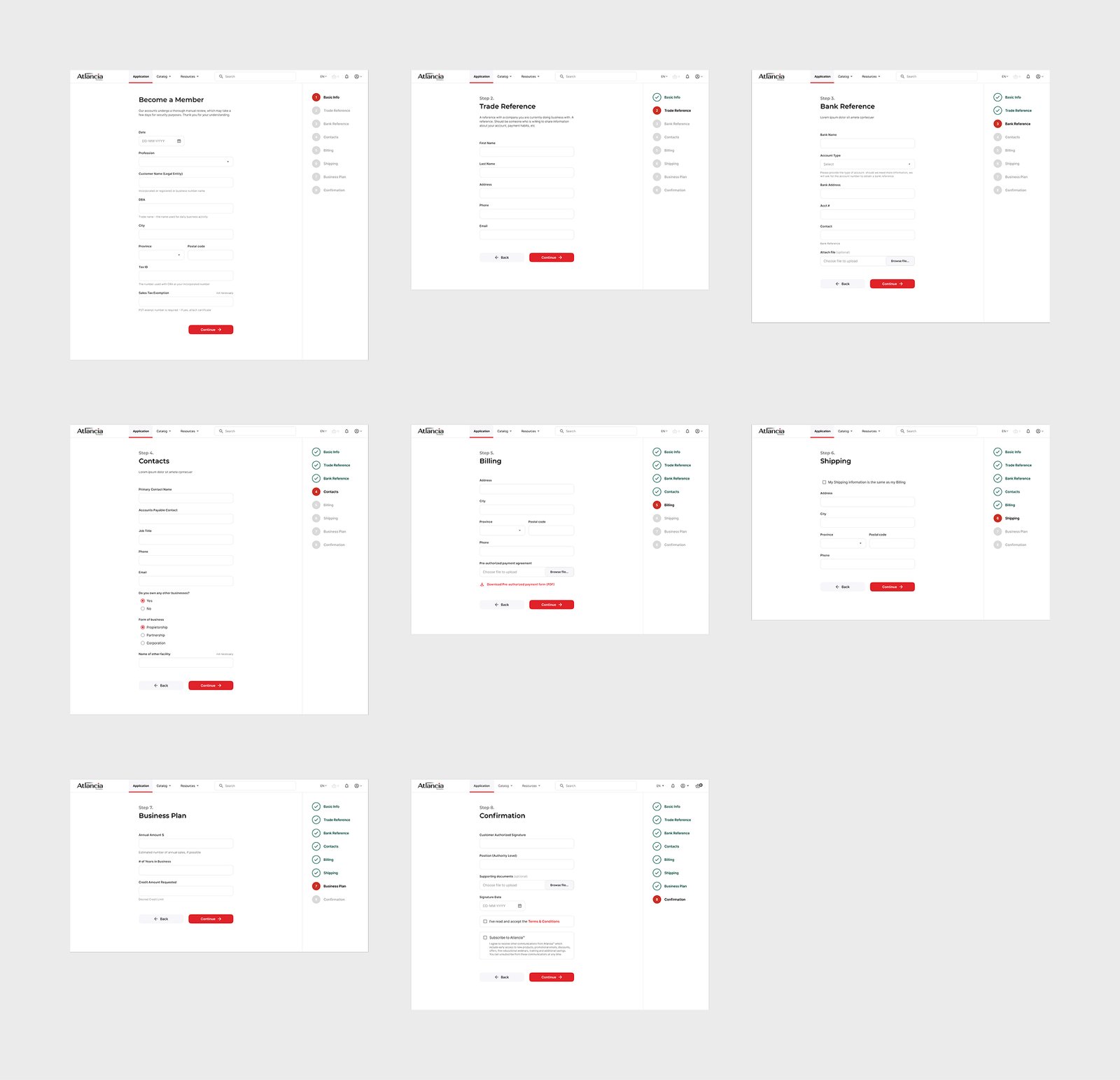
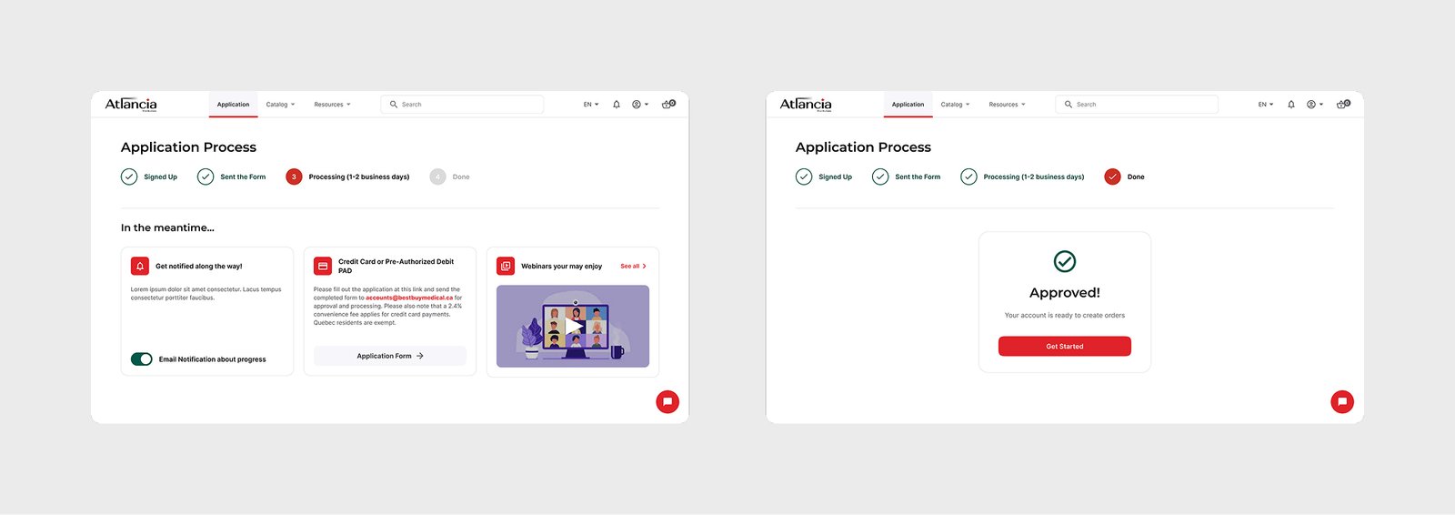
Registration & credit application. This was the piece that didn’t exist before. New business accounts go through a multi-step application — company and trade references, bank reference, contacts, billing and shipping details, and a business plan — followed by email verification and a visible application-status tracker, so a buyer waiting on credit approval always has a clear read on where things stand.
The PAD authorization step in particular follows the wording and layout of an actual Pre-Authorized Payment Agreement, since it needed to hold up as a real financial authorization.
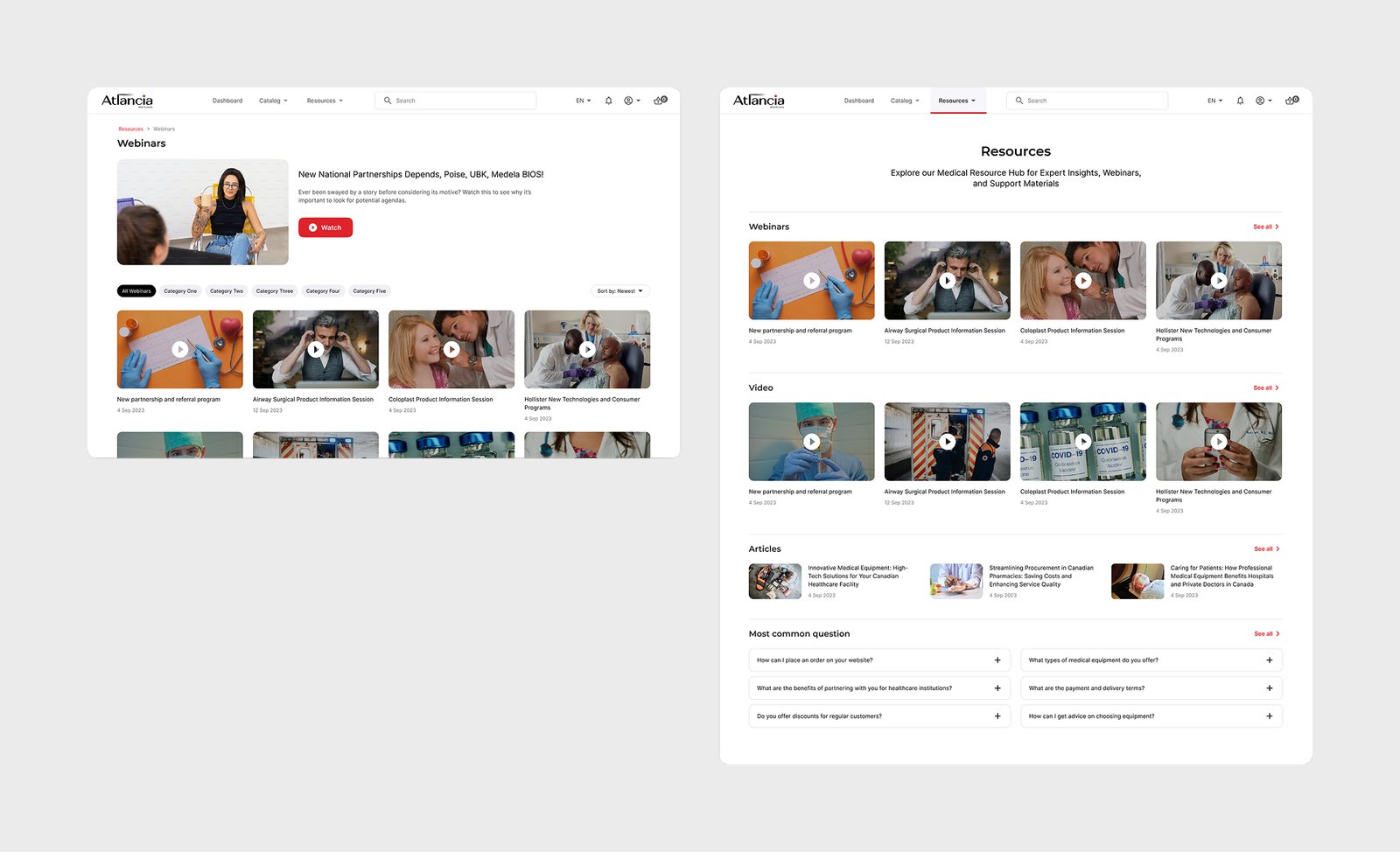
Resources. A webinar, video, and article hub plus an FAQ section, giving buyers a place to get product and account questions answered without opening a support ticket.
Outcome
This was a fixed-scope agency engagement that ended at handoff, so there’s no traffic or conversion data attached to it — and I’m not going to invent any.
What I can point to is the process itself: every screen in the file went through client review and was signed off before moving forward, from the earliest wireframes through the final hi-fi flows.
The real deliverable here was turning a mismatched storefront into an actual wholesale ordering system, end to end.
Reflection
If I were doing this again, the one thing I’d push harder for is real usability testing with actual buyers — pharmacists, clinic staff — instead of only walking the two prototypes with the client.
That caught real edge cases and got sign-off, but it tested whether the client agreed the flow made sense, not whether an unfamiliar buyer could get through registration or checkout unassisted.
Everything else about the process — running the audit first, defining personas before touching pixels, iterating the dashboard from nothing — I’d keep exactly as it was.