

Role: Product Designer & Solo Builder — product decisions, UX/UI, and iOS development (SwiftUI, AI-assisted)
Project: CarState — a personal iOS app for car maintenance tracking. Self-initiated, built solo
Every car-maintenance app I tried was either broken, confusing to use, or charged a subscription for features that should’ve been free. None of them looked like something I’d trust with my car. So I designed and built my own — it’s now live on the App Store.
The Problem
I drive a 2012 Toyota Matrix — cheap to buy, not cheap to keep alive. I didn’t know cars, so I leaned on ChatGPT to figure out what actually needed attention and when. That made one thing obvious: staying on top of an old car takes real, continuous tracking.
I checked the App Store for something that already did this and downloaded about ten car-maintenance apps. Every one was broken, awkward to use, or wanted a subscription for the basics — none looked like something you’d trust with your car.
Market & Competitor Analysis
Working alone, I skipped a lot of the process I’d normally run on a team project. I looked at the competitors I’d need to beat and found the pattern most of them converged on — a baseline feature set to react to rather than invent from nothing, since I was solving my own problem rather than researching a hypothetical user. I still had to rework the mechanics and UX myself, and as a designer I wanted it to actually look good too, which the competitors mostly didn’t.
That gave me four foundations for the product:
- Mileage records — the core data point everything else calculates from.
- A service list — the maintenance actions a car actually needs, on a schedule measured either in kilometers driven or in months, whichever comes first.
- Widgets and reminders — so a user doesn’t have to open the app to know their car’s current state.
- Cloud storage with shared access — this one turned out to matter more than I expected: it’s what eventually opened the door to using CarState as a business tool, not just a personal one.
Designing the core experience
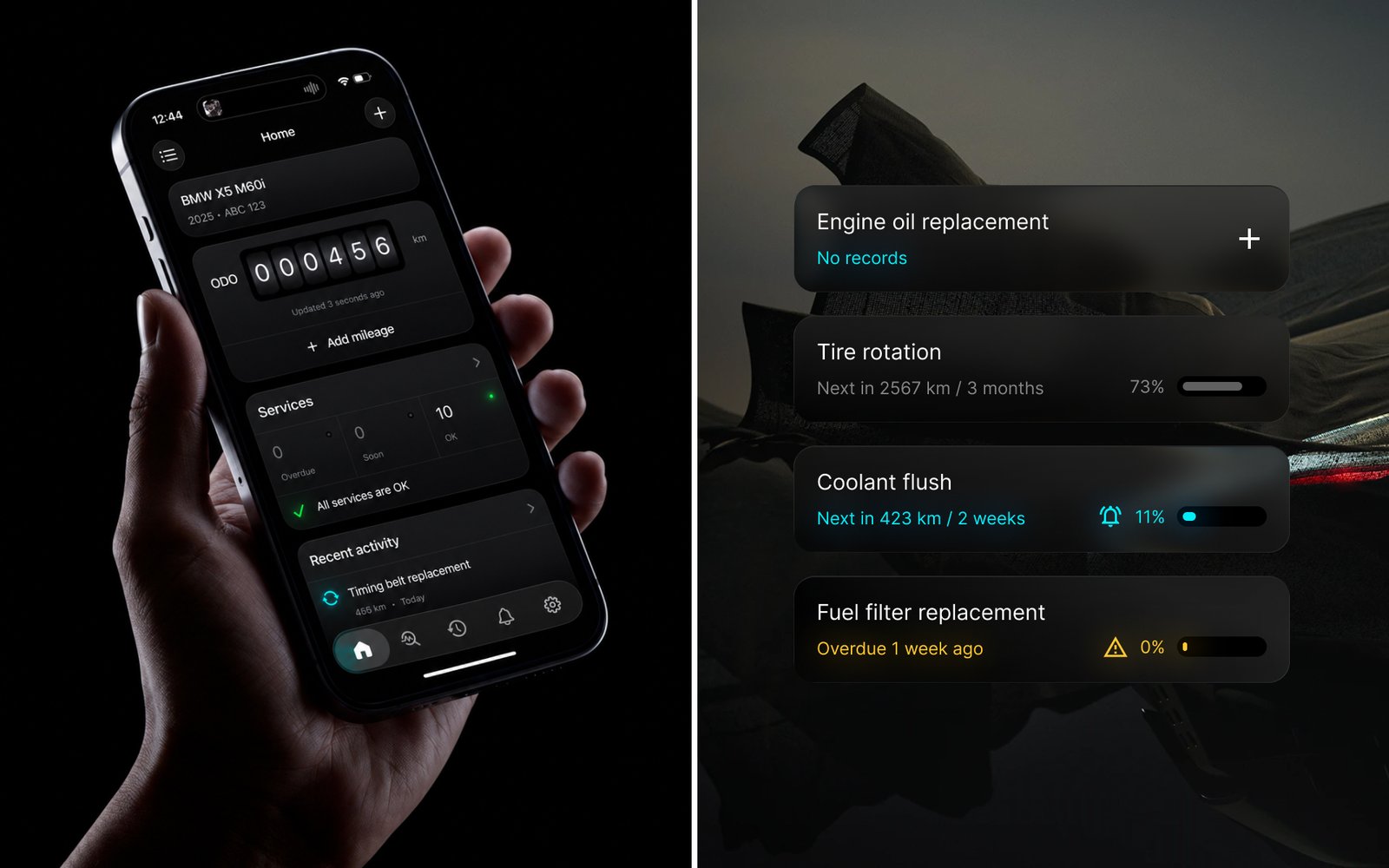
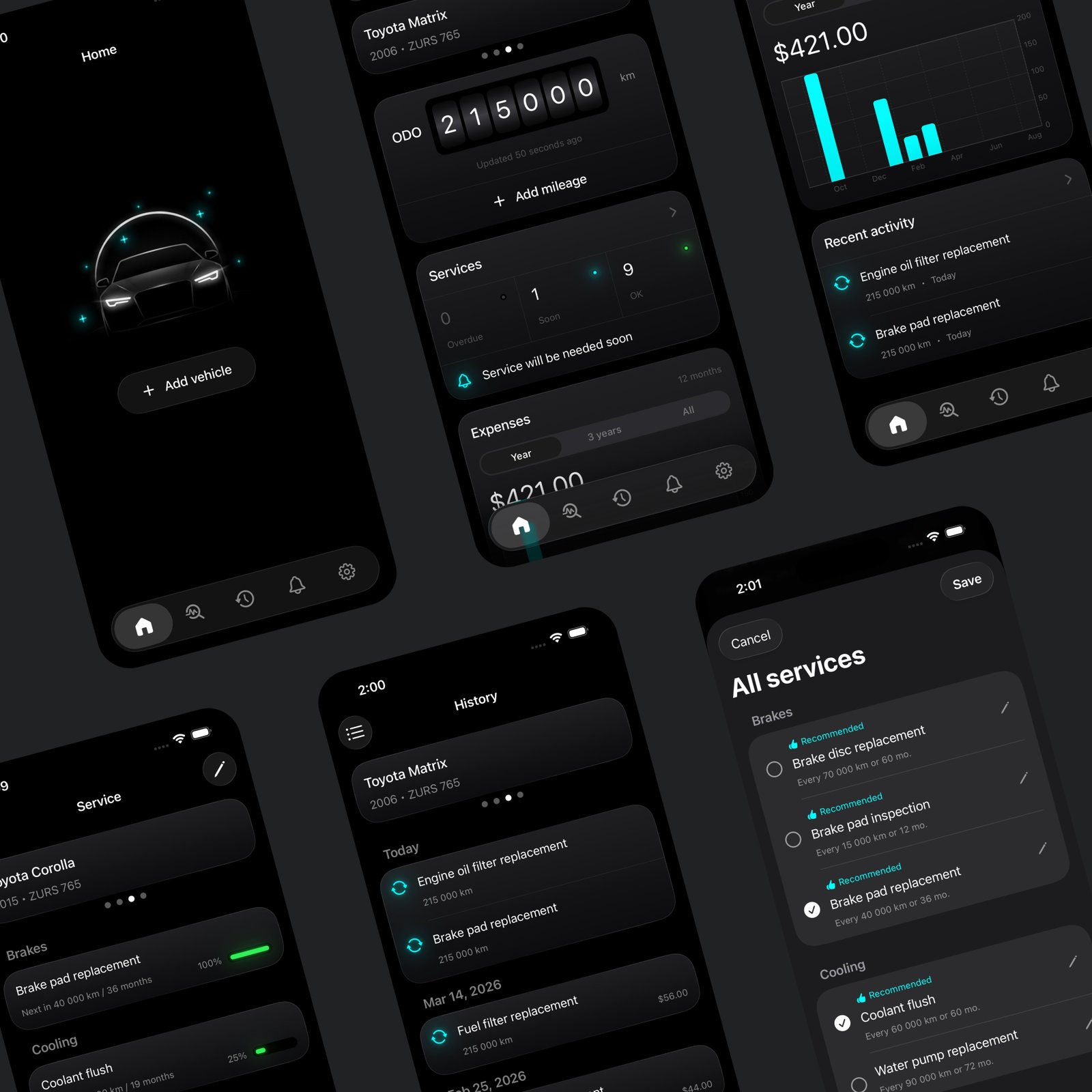
Adding a vehicle creates a starting structure — 9 categories and 18 template services — instead of an empty list, so people who don’t already know their car’s full maintenance checklist don’t have to build one from scratch.
Each service is either a Check or a Replace action. Preset services keep that type fixed, so the templates stay meaningful; anything a user adds themselves can be edited freely. Every service card carries one of 4 states — OK, upcoming, overdue, or empty — with a progress indicator and a warning icon where it’s due, so the same list reads as empty on day one and as a real status board once it’s populated.
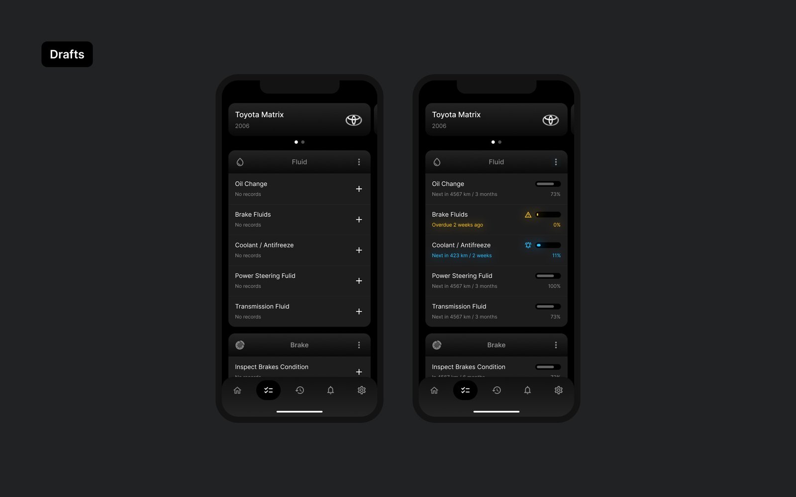
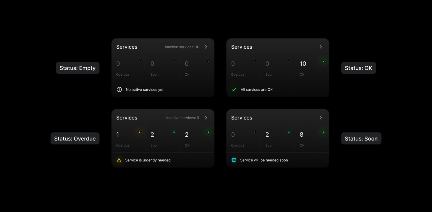
Getting that to actually work meant the interface had to react correctly to every change — early on, editing or deleting a service didn’t update what was on screen, which meant an action could succeed and still look like nothing happened. Fixing that was as much a UX problem as a technical one: a saved change has to be visible immediately, or the state system above means nothing.
History runs the same discipline: each service keeps its own record of past work — date, mileage, an optional note — with a real empty state when there’s nothing yet, and the latest odometer reading pre-filled so you’re not re-entering it every time. Completing a service and updating the odometer both write to that history automatically, without creating a duplicate entry for the same date and mileage.
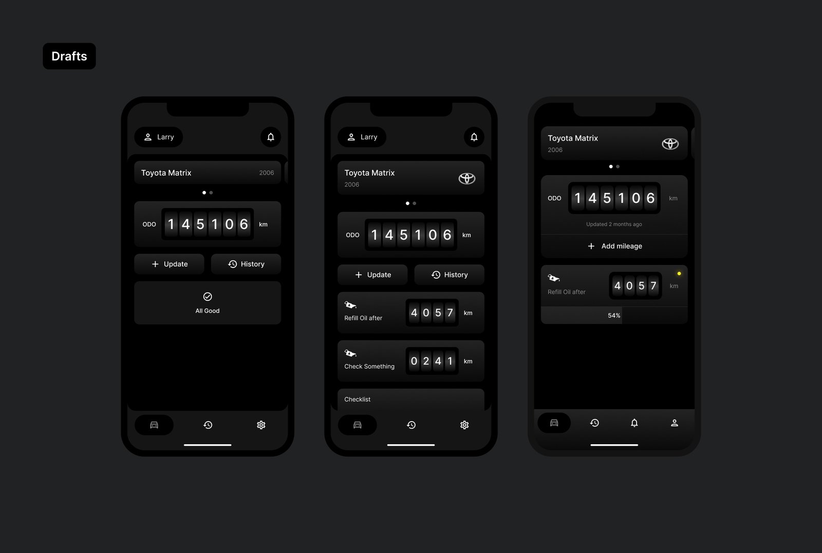
The Home screen went through the most visible iteration. Early versions were a single status card; later ones broke it into a two-card row, then a four-item grid of circular gauges — Motor Oil, Brake, Tires, Engine — each showing percentage-to-due at a glance.
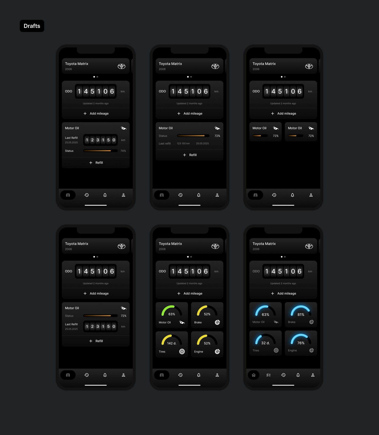
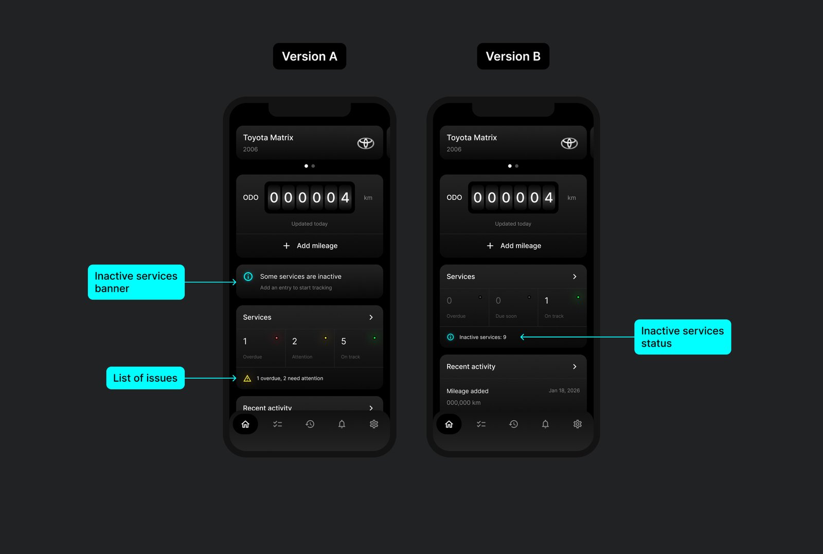
I compared versions like this constantly rather than committing to the first idea that worked. One example: how to surface inactive services — the ones a new car has that aren’t tracked yet. Version A used a separate banner plus a list of issues below the Services card; Version B folded it into the card itself as one line (“Inactive services: 9”). I went with the more compact version — it kept the same information without a second element competing for attention.
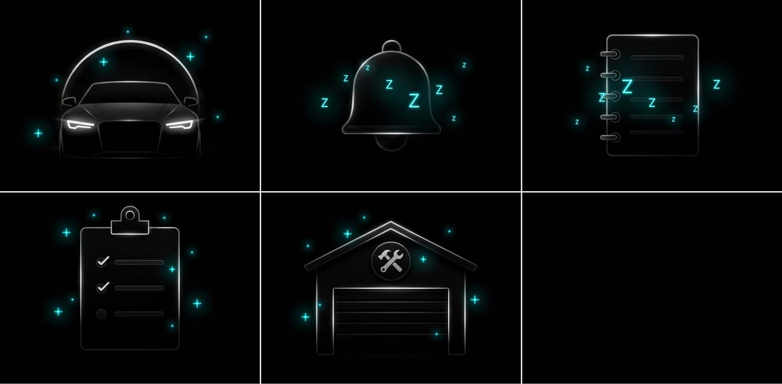
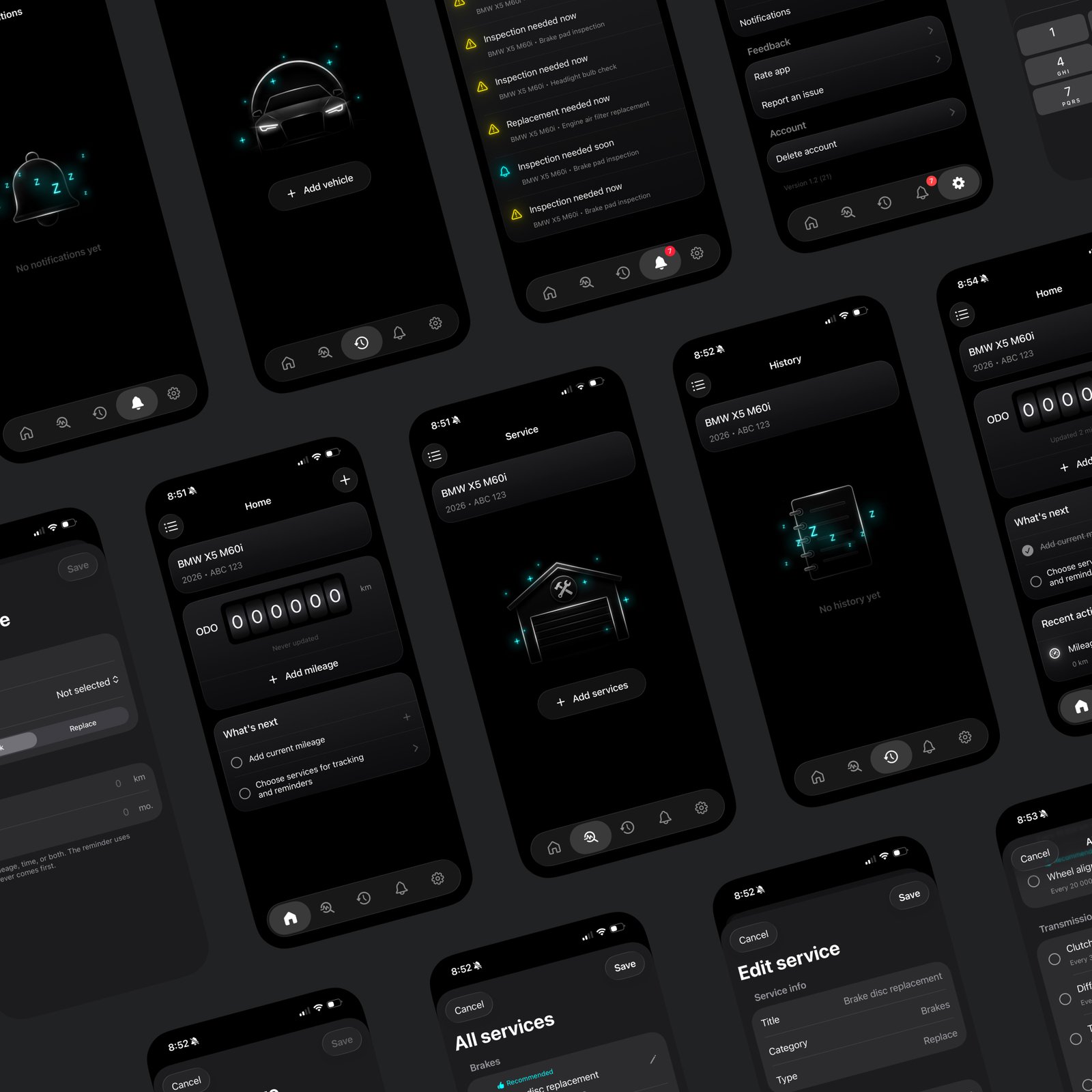
Every empty state — no vehicle yet, no notifications, no history — got its own illustration rather than a blank screen or a generic icon. I generated the first pass with AI and then refined each one by hand until it actually matched the rest of the product.
Mapping all of this as a flow — onboarding, vehicle setup, Home, services, history — is what turned the four pillars above into an actual app structure instead of a feature list.
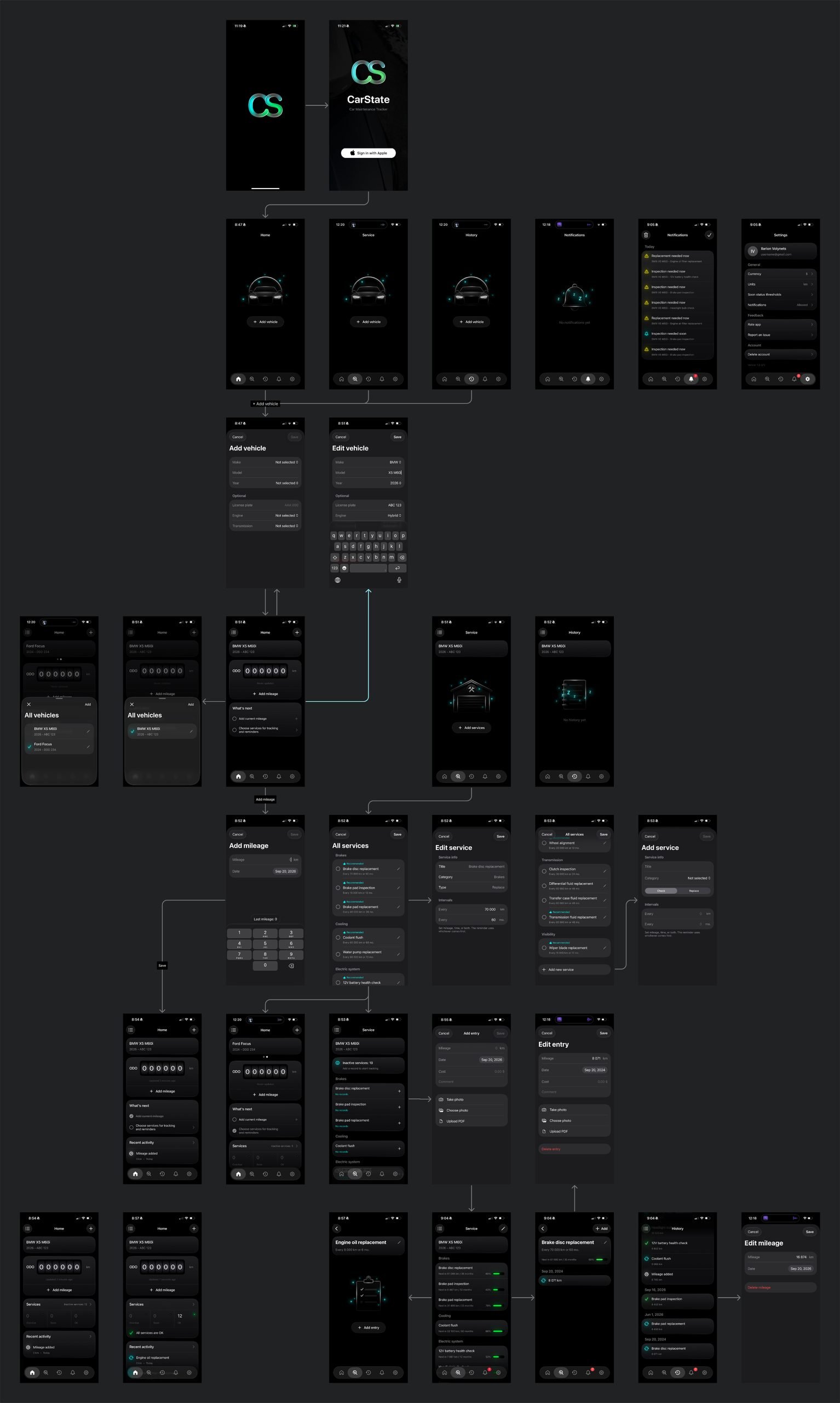
From design to a working app
The app runs on SwiftUI and Xcode, with Core Data for local storage and CloudKit for sync. The data model centers on five entities — Vehicle, MileageEntry, Service, ServiceCategory, ServiceEntry — plus structures for user profile and shared-vehicle access.
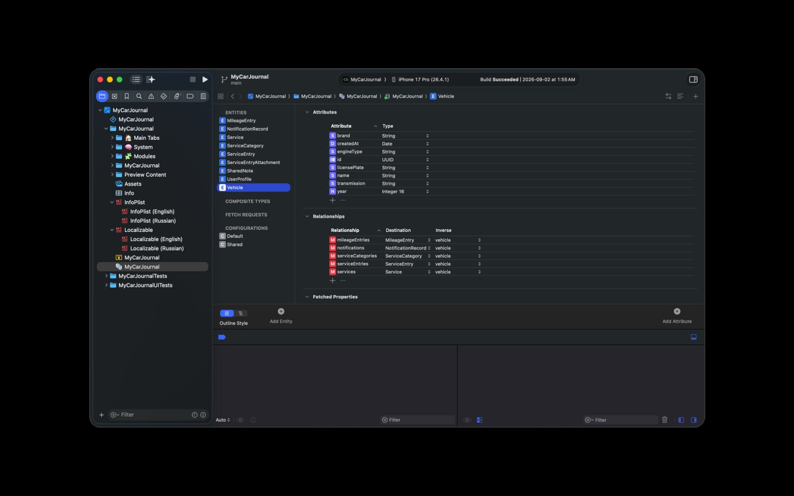
The app itself is organized around five areas — Home, Service, History, Notifications, Settings — with separate modules for vehicles and mileage, Sign in with Apple for auth, and its own layer for scheduling and managing reminders.
Tests passing wasn’t the same as the data layer being verified. Early runs passed, but Core Data kept logging ambiguous entity-mapping warnings underneath — a reminder that a green checkmark on a couple of tests doesn’t mean the whole data layer is sound.
Cloud sync turned out to be where the real UX problems lived, not just a backend detail. Sharing access to a vehicle would hang, and generating a share link could fail outright. Worse, a shared object only reflected changes after a full app restart — which, to a user, just looks like the app losing their data. I settled on handling remote changes through Core Data’s persistent history and merging them into the shared context, in a dedicated helper rather than folding that logic into the main persistence controller.
That work is also what turned CloudKit sharing from a technical feature into a business idea: if data can already sync across accounts, the same mechanism works for a company with a fleet of vehicles that needs central visibility and multiple drivers logging mileage on their own schedule — not just one owner tracking one car.
The UX challenge underneath all of this was that I was building for people who don’t already know car maintenance — I couldn’t just borrow patterns from competitors built for experienced owners. So the app helps at every stage of getting used to it: first-steps guidance, setup recommendations for services, and situational tips and reminders as you go. A reference guide for new owners and an AI assistant are both still in progress.
Working with AI as a build partner
Building with AI meant a real back-and-forth cycle: I’d bring code, describe what I was actually seeing happen, run the app, and come back with logs. AI helped break down problems and propose changes and tests — but I was the one setting what the expected behavior should be and checking the result against it, not taking output at face value. When recommendations conflicted — CKSyncEngine vs. NSPersistentCloudKitContainer with CKShare came up more than once — I had to weigh them against the architecture I’d already built and how the app was actually behaving, not just which suggestion sounded newer.
Getting to beta
Spring 2026 was mostly plumbing: project paths in Xcode broke in a way that clearing DerivedData didn’t fix, which turned into a deeper look at where the project actually lived on disk and what still pointed to old file locations.
By May, CarState’s identity was locked into the actual App Store setup — Bundle ID com.larryv.carstate, SKU carstate-ios — with Xcode Cloud handling builds into App Store Connect and TestFlight.
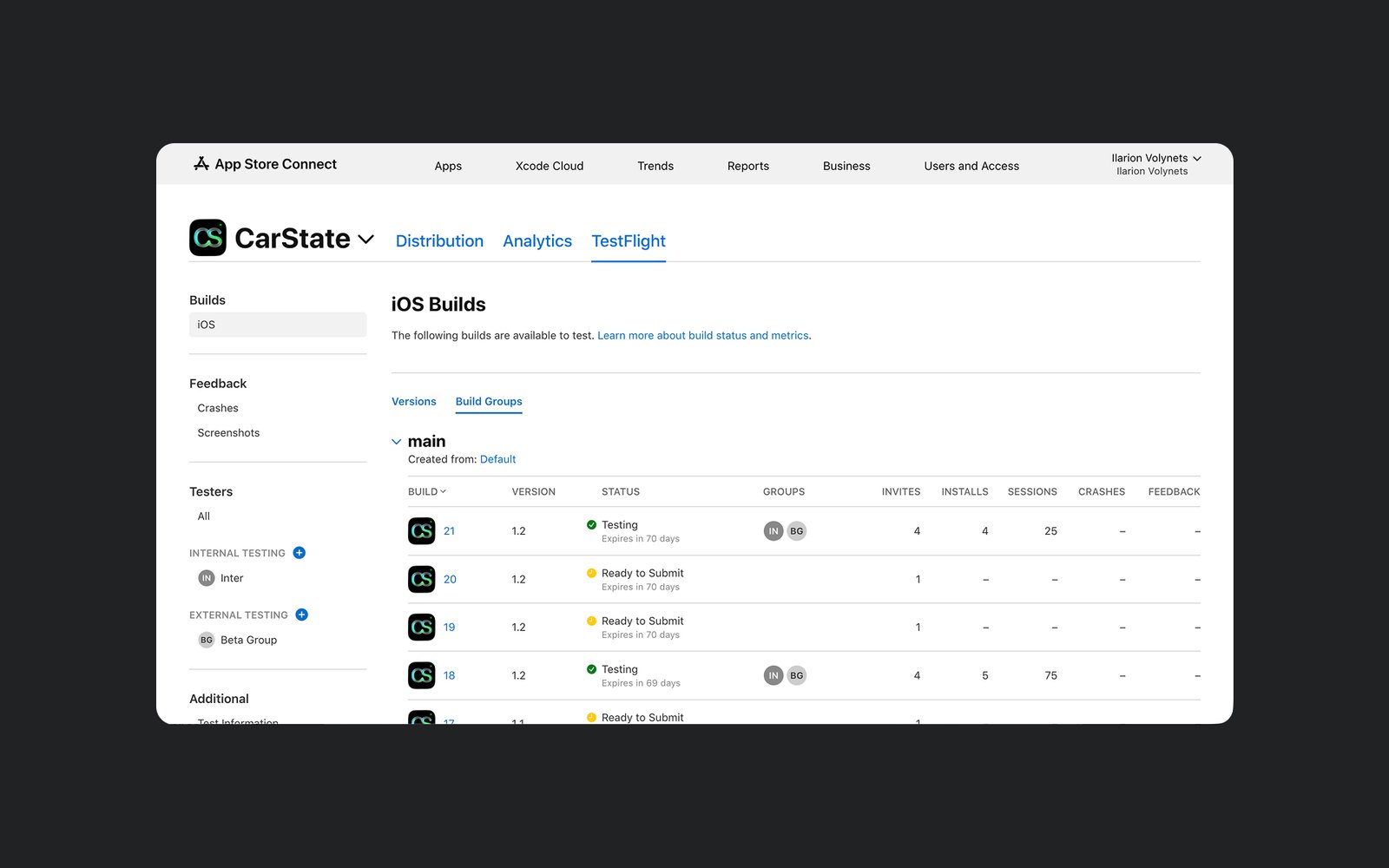
Getting a build in front of people meant learning the difference between an Archive, an internal TestFlight build, and one cleared for external beta testers — distribution turned out to be its own real piece of work, separate from the interface and the code.
External testing is what actually surfaced the sync problem: the same build that worked fine internally showed unstable CloudKit sync once real external testers were on it — changes that hadn’t synced yet would disappear after a reinstall, even though some of those records did show up in CloudKit’s Production environment. That gap between “the record technically made it to the cloud” and “the app reliably shows it back to the user” is the honest state of sync reliability as of the last test I ran.
Outcome
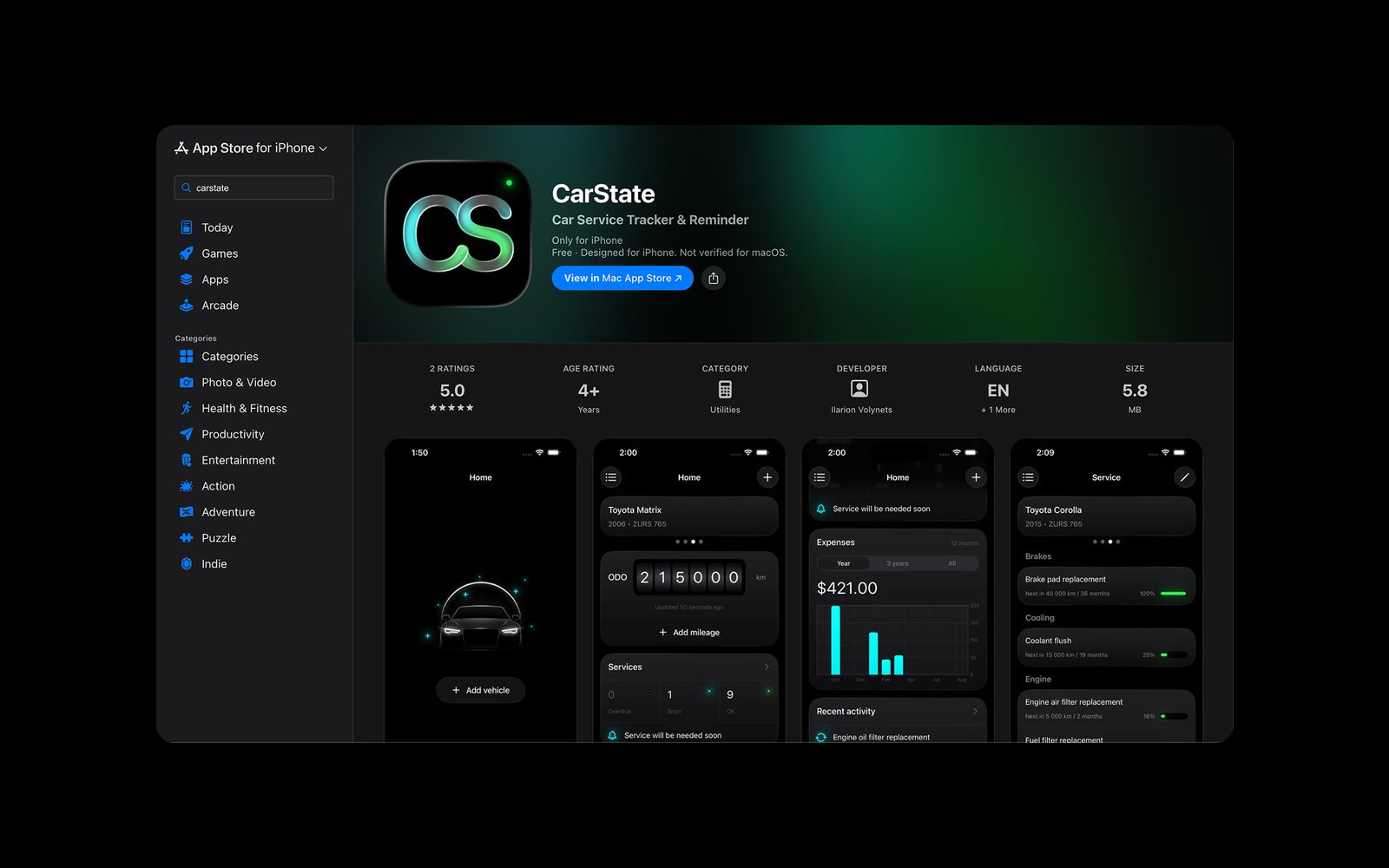
CarState is live on the App Store today — “Car Service Tracker & Reminder,” free, in the Utilities category.
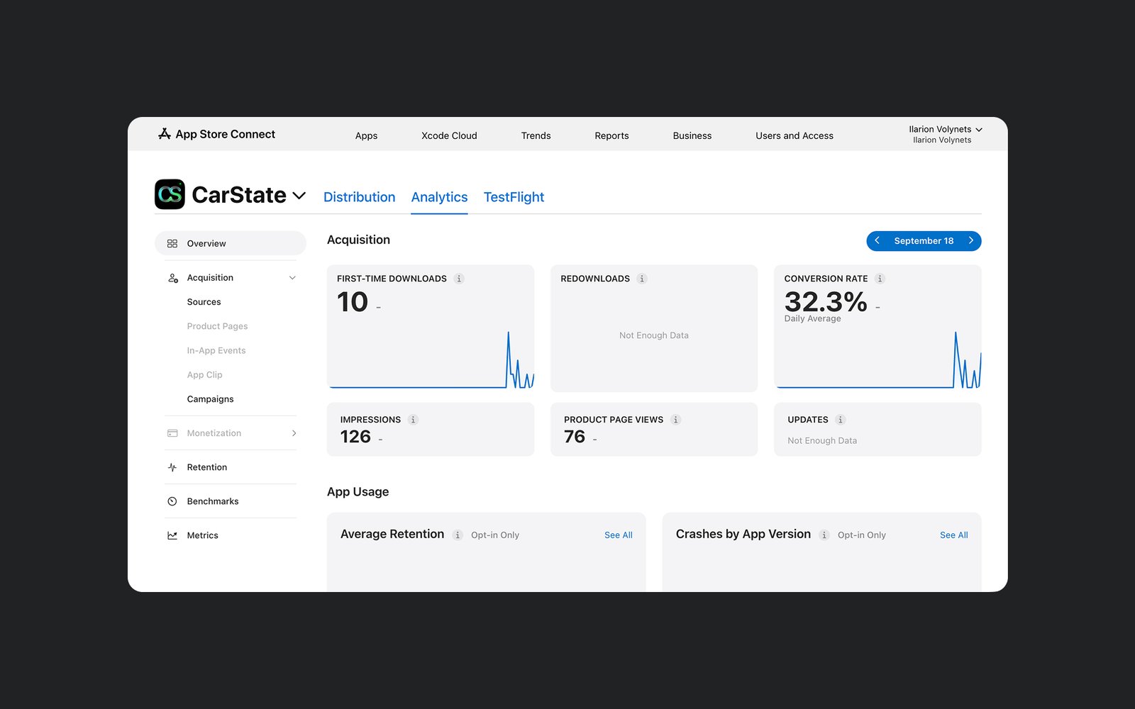
It has real, if early, numbers behind it: 10 first-time downloads and a 32.3% conversion rate as of the analytics snapshot below, off 126 impressions and 76 product page views.
The beta groups before that showed real usage too — an internal group and an external Beta Group both actively opening and using builds, tens of sessions logged against a handful of installs.
Sync reliability is the one piece I’d call still open rather than solved — real, but not yet proven durable under every reinstall/restore scenario a user might hit.
Reflection
The biggest lesson from CarState was how tightly design is coupled to data behavior. A card that doesn’t refresh after an edit, or history that doesn’t come back after a reinstall — no amount of visual polish fixes that. A tool people use to track something as consequential as their car’s maintenance has to be predictable exactly in those moments, or it isn’t trustworthy at all.
Working with AI let me go further into implementation than I would have alone — I could set the rules, argue through the architecture, and check the result against a running app, all without a separate engineer in the loop. But the verification stayed mine to do at every step, from how a service links to a vehicle to how a cloud build actually behaves for someone who isn’t me.