
As a Senior Designer at Port443, I led a team of designers and managed our design system. I often took initiative to improve our workflow — from system architecture to internal tools. One of those tools, which later became essential to the team, started as a solo side project to solve a specific pain point with Figma Variables.
We had three similar but personalized products built on a shared codebase.
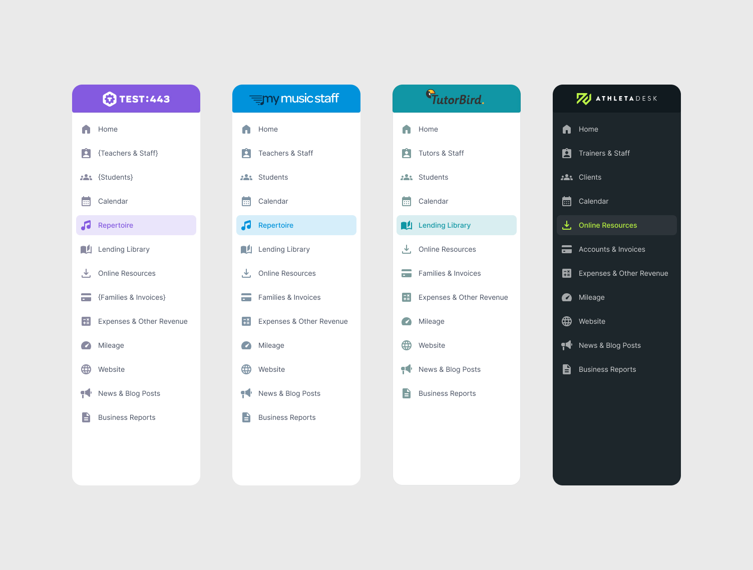
Instead of duplicating mockups, we used Figma Variables with modes to switch between products inside a single file.
Modes controlled not just color themes, but also logos, component variants, key labels, and other product-specific details. Each design token supported four modes, allowing us to design once and preview all variations instantly.
The Problem
Originally, the design system was fragmented. There was no single source of truth — styles were inconsistent, changes were manual, and teams duplicated effort across similar products. To fix this, I led a rebuild of the design-system using structured design tokens and components.
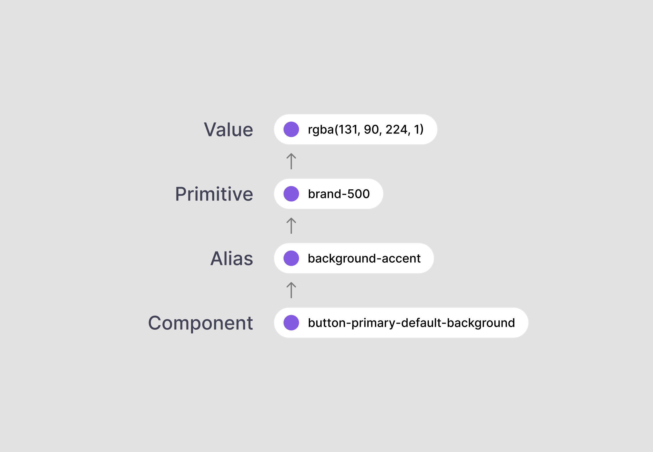
Figma Variables helped solve part of the problem: we used modes to toggle between our three products within a single file. But it revealed a deeper challenge — Figma made it hard to trace how tokens were connected across aliases and modes. Many tokens were built as alias chains: a component token referencing a brand token referencing a primitive. Multiply that by 500 tokens × 4 modes — and tracing any one value became painful.
Third-party token tools didn’t solve it — they were built for one-time exports, not as living documentation. And in a fintech context, cloud-based services were off the table due to security and longevity concerns.
We needed something internal, inspectable, and permanent — a tool that would help everyone understand tokens at a glance and keep design and code in sync.
Goal & Constraints
My goal was to create a scalable, token-based system that keeps Figma and code in sync — without relying on manual tracking or third-party services. The tool had to become a clear, visual source of truth for all design tokens, support multi-product modes, and evolve with our design system.
Eliminate guesswork and reduce overhead in managing a multi-product, token-driven design system.
No External Services
Security and stability were non-negotiable. We couldn’t depend on cloud-hosted tools like ZeroHeight or Supernova. The solution had to live inside our Figma files.
Plugin Limitations
Plugins didn’t persist on the canvas and lacked support for multi-mode alias chains. We needed something always visible — a widget, not a popup.
No Full Auto-Sync to Code
Fully automatic token export was too risky. We wanted human oversight. Our process had to be semi-manual: tokens in Figma, clear visual documentation, code updated with intent.
Design Tooling Constraints
We committed to Figma’s native Variables for usability and longevity. But this meant working within the constraints of the Variables API and Figma Widget sandbox — no background processes, no widget-to-widget communication.
Token Complexity
Our tokens formed a 3-level hierarchy, and each had 4 modes. The widget had to visualize both token chains and mode values.
Scale and Performance
With over 500 tokens across 4 modes — essentially 2000+ values — rendering everything at once would have been overwhelming. I needed a method to organize the data and optimize performance.
Different User Roles
Developers needed clear references for implementation. Designers needed clarity and onboarding help. I, as the design system owner, needed visibility, control and integration. The UI had to bridge all three perspectives.
Exploration
Before jumping into development, I took time to explore existing tools and approaches — hoping to avoid reinventing the wheel.
Third-Party Platforms
Tools like ZeroHeight or Supernova offered token sync and docs, but they were subscription-based and cloud-hosted — a dealbreaker for our security-focused fintech context. We couldn’t afford vendor lock-in or the risk of service shutdowns.
Existing Figma Plugins
Community plugins helped export tokens, but treated it as static output. They lacked support for multi-mode aliases and weren’t built for persistent documentation. Most importantly, plugin results disappeared once closed.
Manual Handover (JSON or Sheets)
Maintaining token lists manually was unscalable. With 500+ tokens and frequent updates, editing or exporting JSON by hand would have been tedious and error-prone. It also made me a bottleneck for every change.
Why a Widget?
None of these options solved the traceability and permanence problem.
So a custom Figma widget — a persistent tool living directly on the canvas.
Persistent Output
Unlike plugins, the widget’s output stays on the canvas — a living, inspectable table. Anyone could open the Figma file and view tokens without needing to re-run anything.
Seamless Sharing
Because it’s native Figma content, devs and designers could easily reference and link to token tables, just like any frame in a file.
Group-Based Flexibility
I designed the widget to work by category — one instance might show primitives, another component tokens. This kept tables focused and maintainable, while allowing fast updates.
Performance-First Design
Instead of loading 2000+ values at once, each widget instance loads only the subset it needs. This kept things fast and readable.
In the end, building the custom widget outperformed existing tools — both in
clarity and control
Building the widget from scratch took time, but the payoff was clear.
I validated early technical risks, confirmed the API could resolve modes and aliases, and committed to building a tool that fit our exact needs — something no existing solution could do.
Solution Design
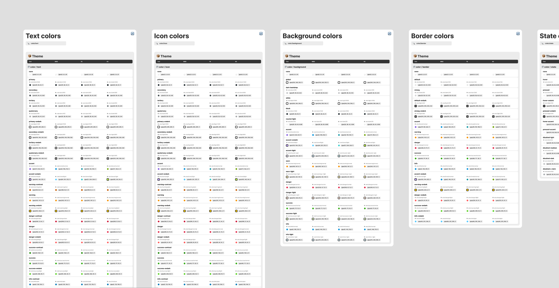
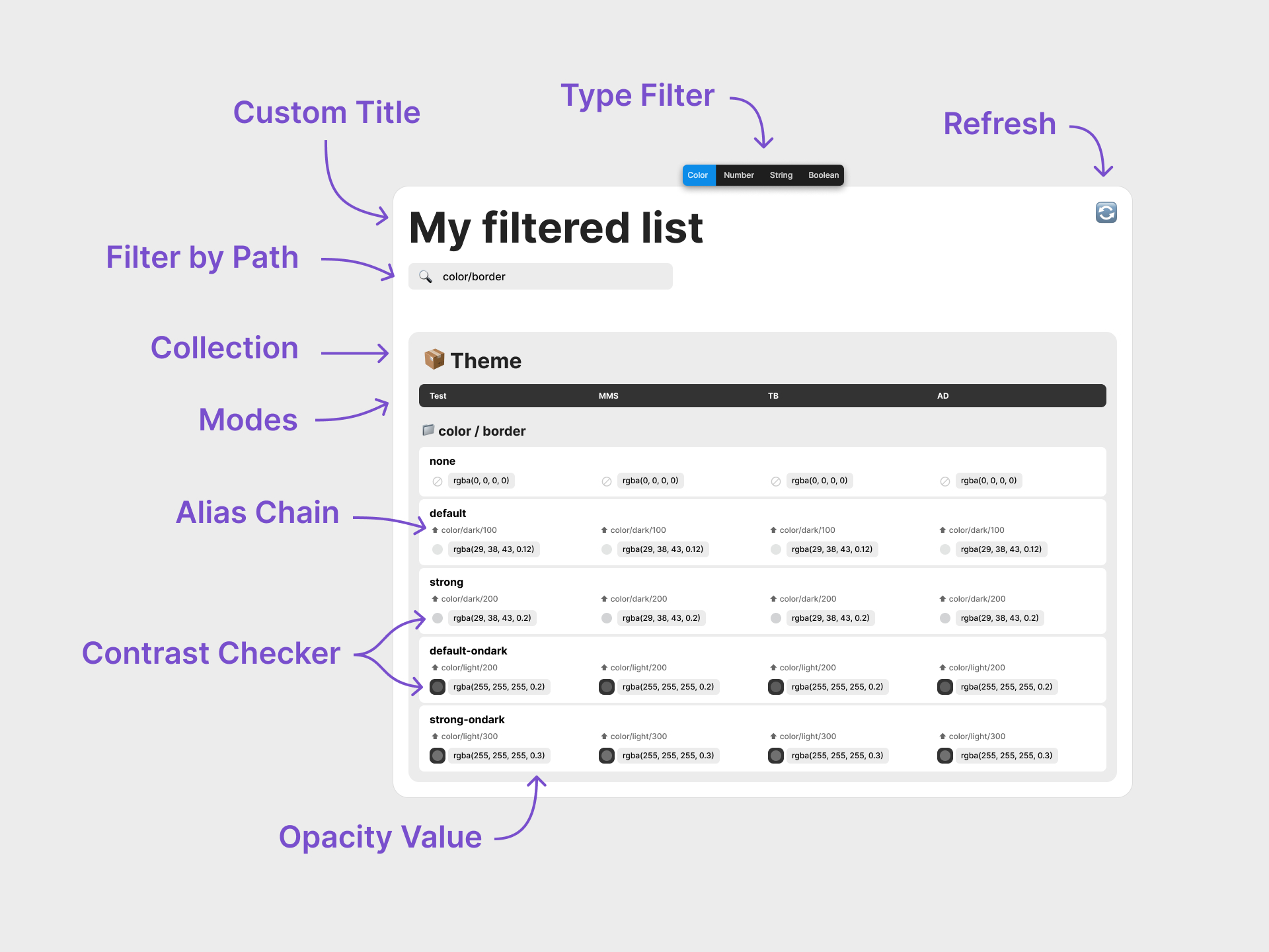
To make our token system easy to inspect and understand, I designed a Figma widget that renders a dynamic table directly on the canvas.
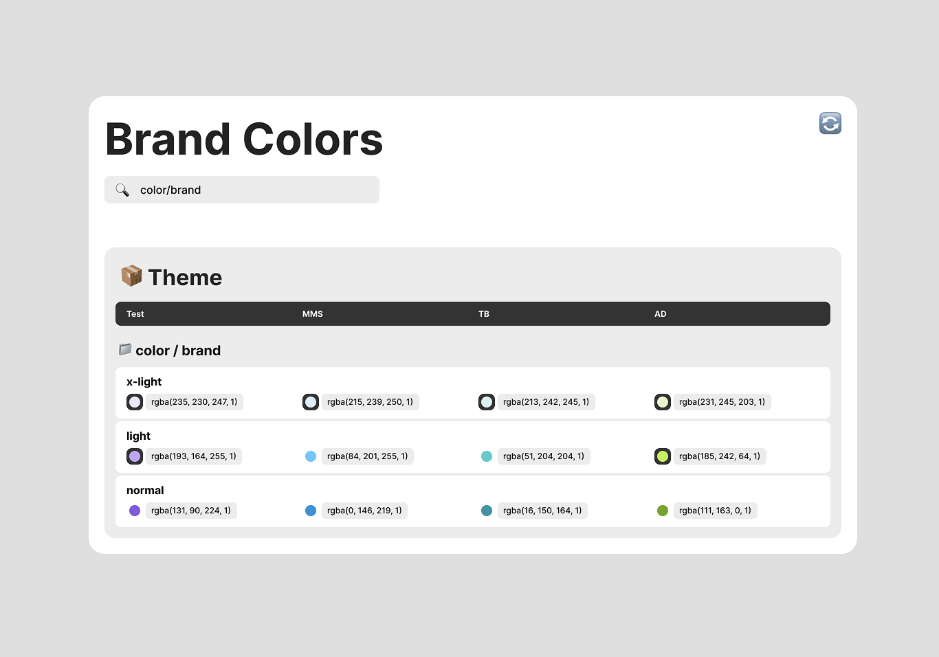
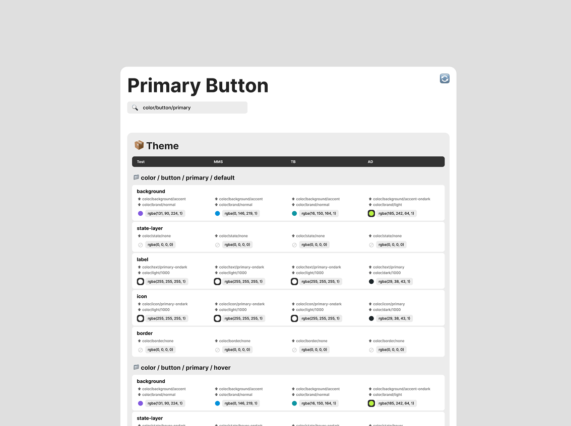
Table Format: Tokens × Modes
Each row represents a token (e.g., Button/Background), and each column shows its value in a specific mode (Product A, Product B, Debug, etc.).
The widget scans available modes and creates columns automatically — making it future-proof. You can compare all mode values side-by-side.
Visualizing Alias Chains
Instead of just showing final values, the widget traces each token’s inheritance path.
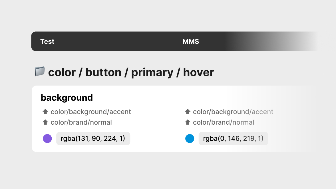
This shows where the value comes from — crucial for debugging, consistency, and dev handoff. None of the existing tools handled multi-level alias chains like this.
Scan & Refresh
A one-click “Refresh” button updates the table with current Figma variables.
No manual input — the widget always reflects the latest token state.
Group-Based Rendering
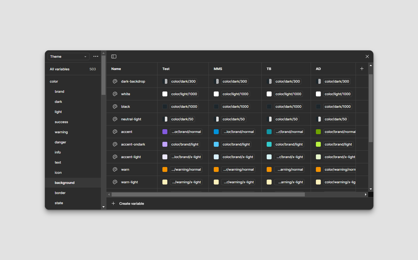
In Figma, tokens are organized using slash-separated paths (e.g., Color/Brand/Normal). The widget uses these paths to filter and render only a specific category — making each instance focused and lightweight.
It made the invisible logic behind every token finally visible
In short, the widget shows all token values across modes, traces where they come from, and stays updated with minimal effort — all within the Figma file.
System Architecture
The widget is a client-side tool built on Figma’s Variables API. Its job: scan tokens, resolve aliases, and render a structured table directly on the canvas.
Token Resolution
When triggered, the widget reads all tokens in a specified group, along with their values across modes. If a token is an alias, it recursively traces the chain until it reaches a primitive value.
Table Generation
The widget dynamically creates an auto-layout frame: one row per token, one column per mode. Cells display either the resolved value or its alias path, using icons, tooltips, or text hints. The result is a persistent, inspectable table directly in the Figma file.
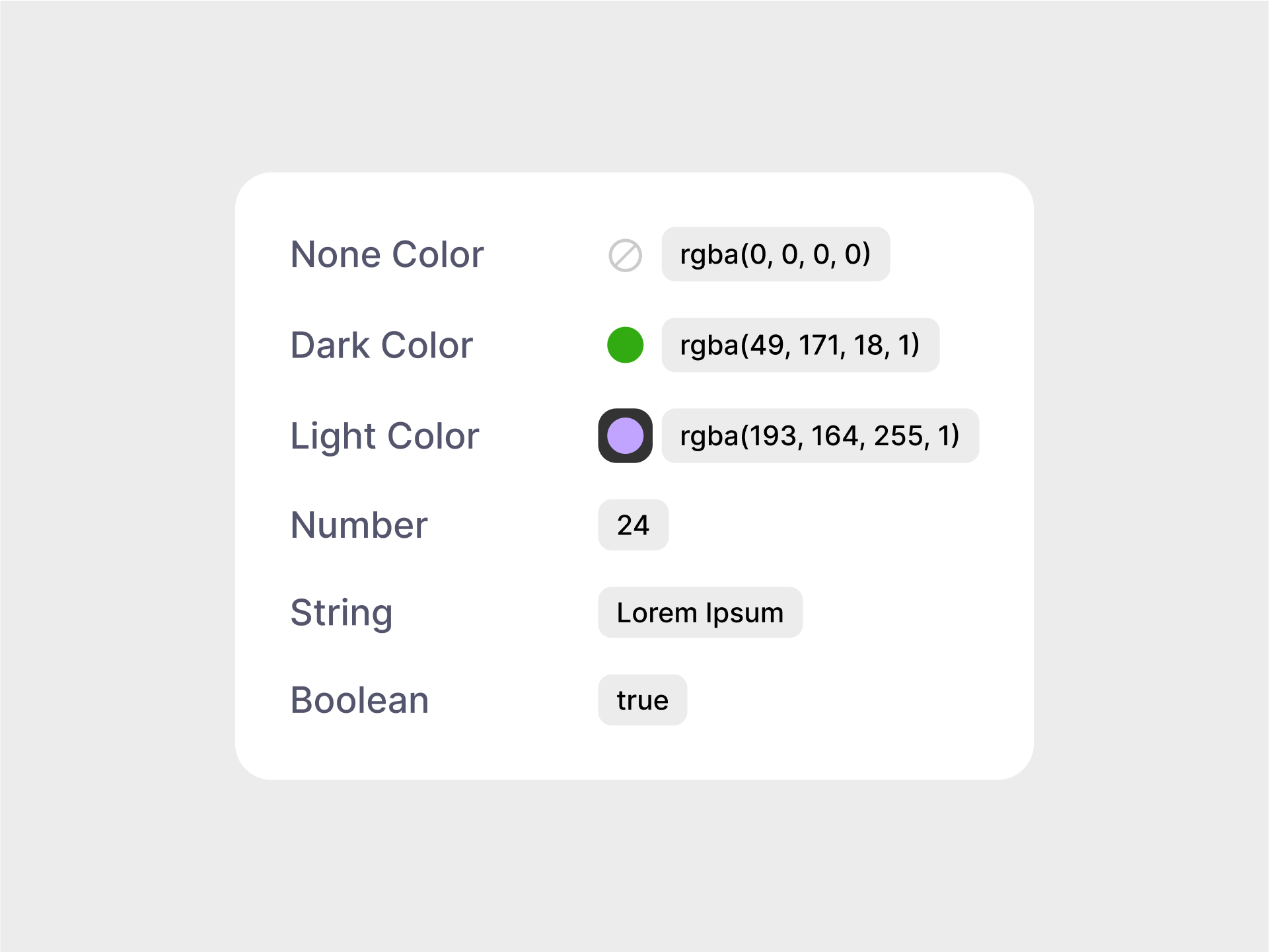
The widget detects each token’s type (Color, Number, String, Boolean) and renders values accordingly. For colors, it checks contrast — dark colors appear on light backgrounds, light ones on dark — for better readability.
Performance & Scope
Each widget targets a specific group (e.g. Buttons, Colors, etc.), avoiding full-document scans. This modular approach keeps the data manageable and improves responsiveness — especially important given Figma’s sandboxed execution model and memory caps.
Refresh Cycle
Widgets don’t run continuously, so updates happen on demand. Refreshing the widget re-renders the table in place, so designers stay in control of when updates go live exactly like publishing a library.
No Cross-Widget Sync
Figma doesn’t support widget-to-widget communication. I considered a global updater, but it added unnecessary complexity. Updating by section turned out to be faster, safer, and more scalable.
Trade-offs by Design
I deliberately skipped features like JSON/code export. Developers preferred referencing the visual tables manually, since implementation often required context-aware decisions.
More than full automation, we needed clarity, control, and shared understanding.
Iteration & Feedback
The widget went through 30+ iterations before reaching its final form, evolving through two key phases.
Version 1 — Raw Dump
The first version simply dumped all available variables from Figma — all types, all tokens, all modes — into one giant unfiltered table. It validated core mechanics like alias resolution and value rendering, but was noisy, overwhelming, and not usable in practice.
Version 2 — Structured Output
The second version introduced critical refinements:
- Filtering by data type: color, string, number, boolean
- Filtering by token path: tokens sharing the same path prefix
- Contrast checker: dark colors appear on light bg, light ones on dark
These changes made the output structured, scannable, and useful — turning the widget into a true documentation tool. Along the way, I improved how alias chains were displayed — simplifying visual hierarchy, spacing, and labels to make token lineage easy to follow.
Team Feedback
Once the refined version was shared, the feedback was instant and positive:
- Designers saw relationships and inheritance clearly
- Developers finally had a reliable, inspectable reference
- Feature requests replaced complaints — a good sign
It began as a raw dump — and evolved into structured documentation.
Impact
The widget didn’t just solve a workflow issue — it reshaped how our team understood, implemented, and trusted the design system.
Clarity for Designers
Designers could finally see the entire token system at a glance — including alias chains and inheritance. What used to require guessing or digging through menus became instantly understandable.
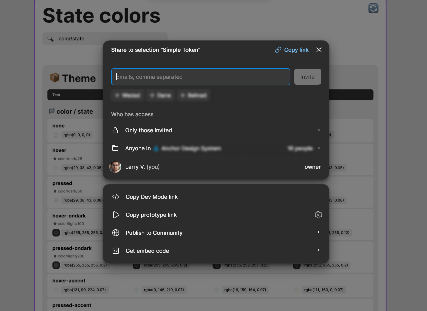
Confidence for Developers
The widget became a trusted reference for implementation. Developers no longer had to ask for specs — they could simply consult the Figma file, check direct link or even get embed code to integrate it to any else environment.
Better Collaboration & Workflow
The widget became a bridge between design and dev. No spreadsheets, no long docs — just a shared source of truth. Designers made changes, ran the widget, and pinged devs. Everyone stayed in sync.
It turned a slow, error-prone workflow into a fast, transparent one
The widget wasn’t a one-off experiment — it became part of our daily toolkit. Even months later, it’s still used, maintained, and referenced. And perhaps most importantly, it showed the team the value of building our own tools when off-the-shelf ones fall short.
Reflection
This project blended design, systems thinking, and coding — and became one of the most rewarding experiences of my career.
What I Learned
Solving a non-standard problem under tight constraints taught me to value unconventional paths. I deepened my understanding of design tokens — not just how to use them in Figma, but how to manage them across design and code. I also taught myself enough widget development to go from idea to functional tool, and realized how much impact a designer–technologist hybrid can have.
Personal Takeaways
This started as a side project on a weekend. I saw a problem, designed a solution, built it, and watched it quietly transform our workflow. It gave me confidence that I can go beyond the designer role when it matters.
It also reinforced a habit I now carry into every project: never build blindly — always understand the why.
When the right tool doesn’t exist, build it. When it works, share it.
In the end, this widget wasn’t just a tool — it was a mindset shift.
It solved a small problem in a big way, and reminded me how design, when paired with curiosity and code, can quietly unlock powerful change.